NumPy Matplotlib
NumPy Matplotlib的例子
pip3 安装:
pip install matplotlib -i https://pypi.tuna.tsinghua.edu.cn/simple
Linux 系统也可以使用 Linux 包管理器来安装:
Debian / Ubuntu:
sudo apt-get install python-matplotlib
Fedora / Redhat:
sudo yum install python-matplotlib
安装完后,你可以使用
python -m pip list 命令来查看是否安装了 matplotlib 模块。
$ pip3 list | grep matplotlib
matplotlib 3.3.0
实例
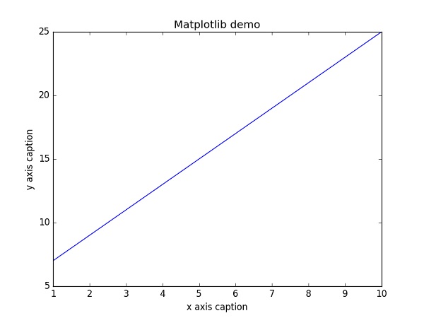
import numpy as np
from matplotlib import pyplot as plt
x = np.arange(1,11)
y = 2 * x + 5
plt.title("Matplotlib demo")
plt.xlabel("x axis caption")
plt.ylabel("y axis caption")
plt.plot(x,y) plt.show()
以上实例中,np.arange() 函数创建 x 轴上的值。y 轴上的对应值存储在另一个数组对象 y 中。 这些值使用 matplotlib 软件包的 pyplot 子模块的 plot() 函数绘制。
图形由 show() 函数显示。
图形中文显示
Matplotlib 默认情况不支持中文,我们可以使用以下简单的方法来解决。
这里我们使用思源黑体,思源黑体是 Adobe 与 Google 推出的一款开源字体。
打开链接后,在里面选一个就好了:
可以下载个 OTF 字体,比如 SourceHanSansSC-Bold.otf,将该文件文件放在当前执行的代码文件中:
SourceHanSansSC-Bold.otf 文件放在当前执行的代码文件中:
import numpy as np
from matplotlib import pyplot as plt
import matplotlib
# fname 为 你下载的字体库路径,注意 SourceHanSansSC-Bold.otf 字体的路径
zhfont1 = matplotlib.font_manager.FontProperties(fname="SourceHanSansSC-Bold.otf")
x = np.arange(1,11)
y = 2 * x + 5
plt.title("立地货 - 测试", fontproperties=zhfont1)
# fontproperties 设置中文显示,fontsize 设置字体大小
plt.xlabel("x 轴", fontproperties=zhfont1)
plt.ylabel("y 轴", fontproperties=zhfont1)
plt.plot(x,y)
plt.show()
此外,我们还可以使用系统的字体:
from matplotlib import pyplot as plt
import matplotlib
a=sorted([f.name for f in matplotlib.font_manager.fontManager.ttflist])
for i in a:
print(i)
打印出你的 font_manager 的 ttflist 中所有注册的名字,找一个看中文字体例如:STFangsong(仿宋),然后添加以下代码即可:
plt.rcParams['font.family']=['STFangsong']
作为线性图的替代,可以通过向 plot() 函数添加格式字符串来显示离散值。 可以使用以下格式化字符。
| 字符 |
描述 |
'-' |
实线样式 |
'--' |
短横线样式 |
'-.' |
点划线样式 |
':' |
虚线样式 |
'.' |
点标记 |
',' |
像素标记 |
'o' |
圆标记 |
'v' |
倒三角标记 |
'^' |
正三角标记 |
'<' |
左三角标记 |
'>' |
右三角标记 |
'1' |
下箭头标记 |
'2' |
上箭头标记 |
'3' |
左箭头标记 |
'4' |
右箭头标记 |
's' |
正方形标记 |
'p' |
五边形标记 |
'*' |
星形标记 |
'h' |
六边形标记 1 |
'H' |
六边形标记 2 |
'+' |
加号标记 |
'x' |
X 标记 |
'D' |
菱形标记 |
'd' |
窄菱形标记 |
'|' |
竖直线标记 |
'_' |
水平线标记 |
以下是颜色的缩写:
| 字符 |
颜色 |
'b' |
蓝色 |
'g' |
绿色 |
'r' |
红色 |
'c' |
青色 |
'm' |
品红色 |
'y' |
黄色 |
'k' |
黑色 |
'w' |
白色 |
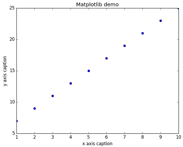
要显示圆来代表点,而不是上面示例中的线,请使用 ob 作为 plot() 函数中的格式字符串。
import numpy as np
from matplotlib import pyplot as plt
x = np.arange(1,11)
y = 2 * x + 5
plt.title("Matplotlib demo")
plt.xlabel("x axis caption")
plt.ylabel("y axis caption")
plt.plot(x,y,"ob")
plt.show()
执行输出结果如下图:
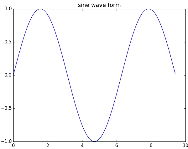
绘制正弦波
以下实例使用 matplotlib 生成正弦波图。
import numpy as np
import matplotlib.pyplot as plt
# 计算正弦曲线上点的 x 和 y 坐标
x = np.arange(0, 3 * np.pi, 0.1)
y = np.sin(x)
plt.title("sine wave form")
# 使用 matplotlib 来绘制点
plt.plot(x, y)
plt.show()
执行输出结果如下图:
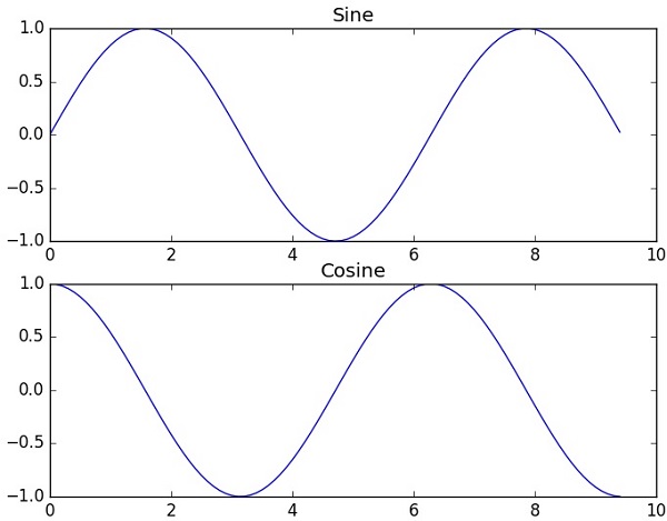
subplot()
subplot() 函数允许你在同一图中绘制不同的东西。
以下实例绘制正弦和余弦值:
import numpy as np
import matplotlib.pyplot as plt
# 计算正弦和余弦曲线上的点的 x 和 y 坐标
x = np.arange(0, 3 * np.pi, 0.1)
y_sin = np.sin(x)
y_cos = np.cos(x)
# 建立 subplot 网格,高为 2,宽为 1
# 激活第一个 subplot
plt.subplot(2, 1, 1)
# 绘制第一个图像
plt.plot(x, y_sin)
plt.title('Sine')
# 将第二个 subplot 激活,并绘制第二个图像
plt.subplot(2, 1, 2)
plt.plot(x, y_cos)
plt.title('Cosine')
# 展示图像
plt.show()
执行输出结果如下图:
bar()
pyplot 子模块提供 bar() 函数来生成条形图。
以下实例生成两组 x 和 y 数组的条形图。
from matplotlib import pyplot as plt
x = [5,8,10]
y = [12,16,6]
x2 = [6,9,11]
y2 = [6,15,7]
plt.bar(x, y, align = 'center')
plt.bar(x2, y2, color = 'g', align = 'center')
plt.title('Bar graph')
plt.ylabel('Y axis')
plt.xlabel('X axis')
plt.show()
执行输出结果如下图:
numpy.histogram()
numpy.histogram() 函数是数据的频率分布的图形表示。 水平尺寸相等的矩形对应于类间隔,称为 bin,变量 height 对应于频率。
numpy.histogram()函数将输入数组和 bin 作为两个参数。 bin 数组中的连续元素用作每个 bin 的边界。
import numpy as np
a = np.array([22,87,5,43,56,73,55,54,11,20,51,5,79,31,27])
np.histogram(a,bins = [0,20,40,60,80,100])
hist,bins = np.histogram(a,bins = [0,20,40,60,80,100])
print (hist)
print (bins)
输出结果为:
[3 4 5 2 1]
[ 0 20 40 60 80 100]
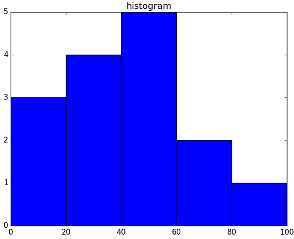
plt()
Matplotlib 可以将直方图的数字表示转换为图形。 pyplot 子模块的 plt() 函数将包含数据和 bin 数组的数组作为参数,并转换为直方图。
from matplotlib import pyplot as plt
import numpy as np
a = np.array([22,87,5,43,56,73,55,54,11,20,51,5,79,31,27])
plt.hist(a, bins = [0,20,40,60,80,100])
plt.title("histogram")
plt.show()
执行输出结果如下图:
Matplotlib 更多参考内容:
用户指南
常见问题及回答
截屏