Python图表样式
Python图表样式详细操作教程
在python中创建的图表可以通过使用用于制图的库中的某些适当方法进一步设置样式。 在本课中,我们将看到注释,图例和图表背景的实现。 我们将继续使用上一章中的代码并对其进行修改以将这些样式添加到图表中。
添加注释
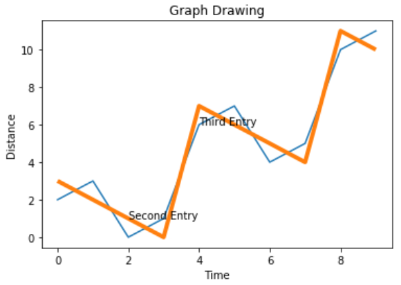
很多时候,我们需要通过突出显示图表的特定位置来对图表进行注释。 在下面的示例中,我们通过在这些点上添加注释来指示图表中值的急剧变化。
# Filename : example.py
# Copyright : 2020 By Lidihuo
# Author by : www.lidihuo.com
# Date : 2020-08-23
import numpy as np
from matplotlib import pyplot as plt
x = np.arange(0,10)
y = x ^ 2
z = x ^ 3
t = x ^ 4
# Labeling the Axes and Title
plt.title("Graph Drawing")
plt.xlabel("Time")
plt.ylabel("Distance")
plt.plot(x,y)
#Annotate
plt.annotate(xy=[2,1], s='Second Entry')
plt.annotate(xy=[4,6], s='Third Entry')
执行上面示例代码,得到以下结果 -
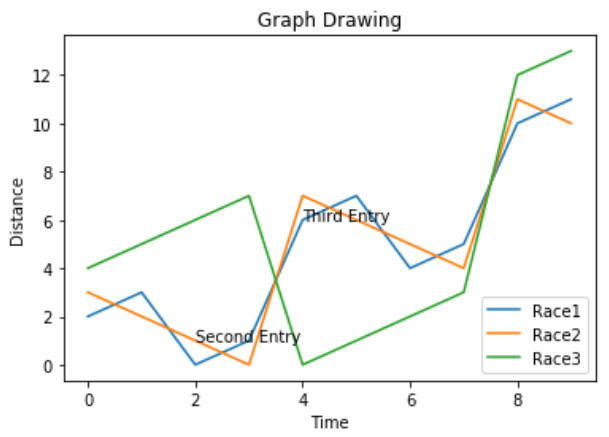
添加图例说明
有时需要绘制多条线的图表。 图例的使用表示与每条线相关联的含义。 在下面的图表中,我们有3条适当的图例。
# Filename : example.py
# Copyright : 2020 By Lidihuo
# Author by : www.lidihuo.com
# Date : 2020-08-23
import numpy as np
from matplotlib import pyplot as plt
x = np.arange(0,10)
y = x ^ 2
z = x ^ 3
t = x ^ 4
# Labeling the Axes and Title
plt.title("Graph Drawing")
plt.xlabel("Time")
plt.ylabel("Distance")
plt.plot(x,y)
#Annotate
plt.annotate(xy=[2,1], s='Second Entry')
plt.annotate(xy=[4,6], s='Third Entry')
# Adding Legends
plt.plot(x,z)
plt.plot(x,t)
plt.legend(['Race1', 'Race2','Race3'], loc=4)
执行上面示例代码,得到以下结果 -
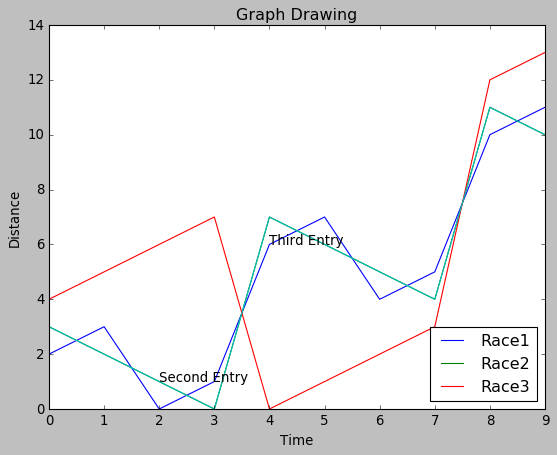
图表演示风格
可以使用style包中的不同方法修改图表的表现风格。
# Filename : example.py
# Copyright : 2020 By Lidihuo
# Author by : www.lidihuo.com
# Date : 2020-08-23
import numpy as np
from matplotlib import pyplot as plt
x = np.arange(0,10)
y = x ^ 2
z = x ^ 3
t = x ^ 4
# Labeling the Axes and Title
plt.title("Graph Drawing")
plt.xlabel("Time")
plt.ylabel("Distance")
plt.plot(x,y)
#Annotate
plt.annotate(xy=[2,1], s='Second Entry')
plt.annotate(xy=[4,6], s='Third Entry')
# Adding Legends
plt.plot(x,z)
plt.plot(x,t)
plt.legend(['Race1', 'Race2','Race3'], loc=4)
#Style the background
plt.style.use('fast')
plt.plot(x,z)
执行上面示例代码,得到以下结果 -