R 饼图
R 编程语言有许多用于创建图表和图形的库。饼图将值表示为具有不同颜色的圆的切片。切片被标记,每个切片对应的数字也在图表中表示。
在 R 中,饼图是使用
pie() 函数创建的,该函数将正数作为向量输入。附加参数用于控制标签、颜色、标题等。
语法
使用 R 创建饼图的基本语法是-
pie(x, labels, radius, main, col, clockwise)
以下是所用参数的说明-
x 是包含饼图中使用的数值的向量。
labels 用于对切片进行描述。
radius 表示饼图圆的半径。(-1 到 +1 之间的值)。
main 表示图表的标题。
col 表示调色板。
顺时针 是一个逻辑值,指示切片是顺时针还是逆时针绘制。
示例
仅使用输入向量和标签即可创建一个非常简单的饼图。下面的脚本将创建饼图并将其保存在当前 R 工作目录中。
# Create data for the graph.
x <-c(21, 62, 10, 53)
labels <-c("London", "New York", "Singapore", "Mumbai")
# Give the chart file a name.
png(file = "city.png")
# Plot the chart.
pie(x,labels)
# Save the file.
dev.off()
当我们执行上面的代码时,它会产生以下结果-
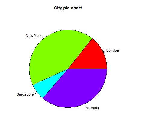
饼图标题和颜色
我们可以通过向函数添加更多参数来扩展图表的功能。我们将使用参数
main 为图表添加标题,另一个参数是
col,它将在绘制图表时使用彩虹色托盘。托盘的长度应与图表的值数量相同。因此我们使用length(x)。
示例
以下脚本将创建饼图并将其保存在当前 R 工作目录中。
# Create data for the graph.
x <-c(21, 62, 10, 53)
labels <-c("London", "New York", "Singapore", "Mumbai")
# Give the chart file a name.
png(file = "city_title_colours.jpg")
# Plot the chart with title and rainbow color pallet.
pie(x, labels, main = "City pie chart", col = rainbow(length(x)))
# Save the file.
dev.off()
当我们执行上面的代码时,它会产生以下结果-
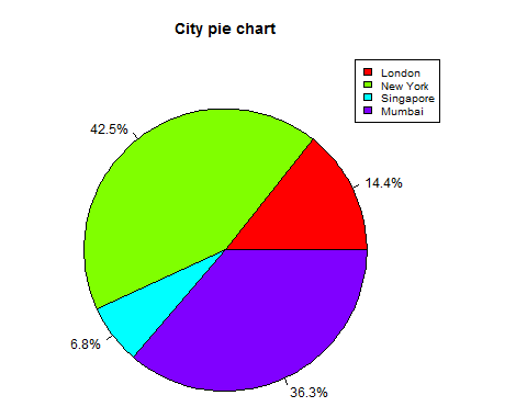
切片百分比和图表图例
我们可以通过创建额外的图表变量来添加切片百分比和图表图例。
# Create data for the graph.
x <- c(21, 62, 10,53)
labels <- c("London","New York","Singapore","Mumbai")
piepercent<-round(100*x/sum(x), 1)
# Give the chart file a name.
png(file = "city_percentage_legends.jpg")
# Plot the chart.
pie(x, labels = piepercent, main = "City pie chart",col = rainbow(length(x)))
legend("topright", c("London","New York","Singapore","Mumbai"), cex = 0.8,
   fill = rainbow(length(x)))
# Save the file.
dev.off()
当我们执行上面的代码时,它会产生以下结果-
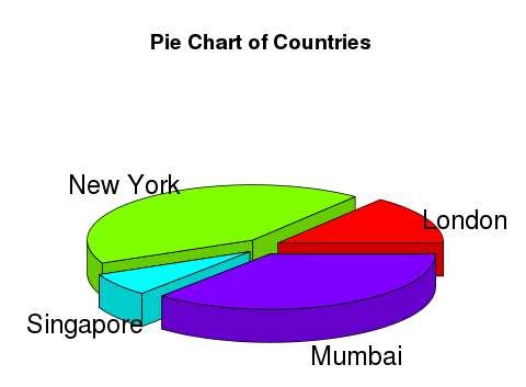
3D 饼图
可以使用附加包绘制具有 3 个维度的饼图。包
plotrix 有一个名为
pie3D() 的函数,用于此目的。
# Get the library.
library(plotrix)
# Create data for the graph.
x <- c(21, 62, 10,53)
lbl <- c("London","New York","Singapore","Mumbai")
# Give the chart file a name.
png(file = "3d_pie_chart.jpg")
# Plot the chart.
pie3D(x,labels = lbl,explode = 0.1, main = "Pie Chart of Countries ")
# Save the file.
dev.off()
当我们执行上面的代码时,它会产生以下结果-