R 散点图
散点图显示了在笛卡尔平面上绘制的许多点。每个点代表两个变量的值。在横轴上选择一个变量,在纵轴上选择另一个。
简单的散点图是使用
plot() 函数创建的。
语法
在 R 中创建散点图的基本语法是-
plot(x, y, main, xlab, ylab, xlim, ylim, axes)
以下是所用参数的说明-
x 是其值为水平坐标的数据集。
y 是其值为垂直坐标的数据集。
main 是图的图块。
xlab 是水平轴上的标签。
ylab 是纵轴上的标签。
xlim 是用于绘图的 x 值的限制。
ylim 是用于绘图的 y 值的限制。
axes 指示是否应在绘图上绘制两个轴。
示例
我们使用 R 环境中可用的数据集
"mtcars" 创建基本散点图。让我们使用 mtcars 中的"wt"和"mpg"列。
input <-mtcars[,c('wt','mpg')]
print(head(input))
当我们执行上面的代码时,它会产生以下结果-
                    wt      mpg
Mazda RX4           2.620   21.0
Mazda RX4 Wag       2.875   21.0
Datsun 710          2.320   22.8
Hornet 4 Drive      3.215   21.4
Hornet Sportabout   3.440   18.7
Valiant             3.460   18.1
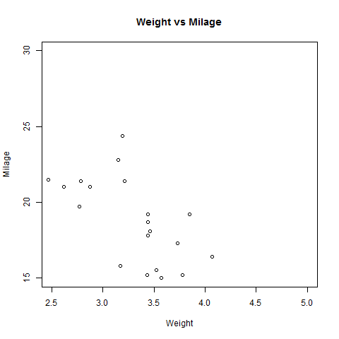
创建散点图
以下脚本将为 wt(重量)和 mpg(英里每加仑)之间的关系创建散点图。
# Get the input values.
input <-mtcars[,c('wt','mpg')]
# Give the chart file a name.
png(file = "scatterplot.png")
# Plot the chart for cars with weight between 2.5 to 5 and mileage between 15 and 30.
plot(x = input$wt,y = input$mpg,
   xlab = "Weight",
   ylab = "Milage",
   xlim = c(2.5,5),
   ylim = c(15,30),
   main = "Weight vs Milage"
)

# Save the file.
dev.off()
当我们执行上面的代码时,它会产生以下结果-
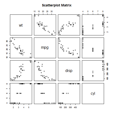
散点图矩阵
当我们有两个以上的变量并且我们想要找到一个变量与其余变量之间的相关性时,我们使用散点图矩阵。我们使用
pairs() 函数来创建散点图矩阵。
语法
在 R 中创建散点图矩阵的基本语法是-
以下是所用参数的说明-
公式表示成对使用的变量系列。
data 表示将从中获取变量的数据集。
示例
每个变量都与剩余的每个变量配对。为每一对绘制散点图。
# Give the chart file a name.
png(file = "scatterplot_matrices.png")
# Plot the matrices between 4 variables giving 12 plots.
# One variable with 3 others and total 4 variables.
pairs(~wt+mpg+disp+cyl,data = mtcars,
   main = "Scatterplot Matrix")
# Save the file.
dev.off()
执行上述代码后,我们得到以下输出。