数据分析 统计方法
在分析数据时,可以采用统计方法。执行基本分析所需的基本工具是-
相关性分析
方差分析
假设检验
处理大型数据集时,不会出现问题,因为这些方法的计算量并不大,相关分析除外。在这种情况下,总是可以取样并且结果应该是可靠的。
相关性分析
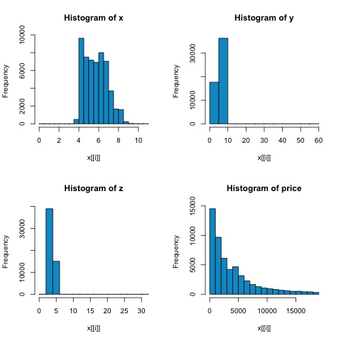
相关分析旨在找出数值变量之间的线性关系。这可以在不同的情况下使用。一个常见的用途是探索性数据分析,在本书的 16.0.2 节中有一个这种方法的基本示例。首先,上述示例中使用的相关度量基于
皮尔逊系数。然而,还有另一个有趣的相关性指标不受异常值影响。该指标称为斯皮尔曼相关性。
spearman 相关性 度量对异常值的存在比 Pearson 方法更稳健,并且当数据不是正态分布时,可以更好地估计数值变量之间的线性关系。
library(ggplot2)
# Select variables that are interesting to compare pearson and spearman
correlation methods.
x = diamonds[, c('x', 'y', 'z', 'price')]
# From the histograms we can expect differences in the correlations of both
metrics.
# In this case as the variables are clearly not normally distributed, the
spearman correlation
# is a better estimate of the linear relation among numeric variables.
par(mfrow = c(2,2))
colnm = names(x)
for(i in 1:4) {
   hist(x[[i]], col = 'deepskyblue3', main = sprintf('Histogram of %s', colnm[i]))
}
par(mfrow = c(1,1))
从下图中的直方图,我们可以预期两个指标的相关性存在差异。在这种情况下,由于变量显然不是正态分布的,因此 spearman 相关性是对数值变量之间线性关系的更好估计。
为了计算 R 中的相关性,打开包含此代码部分的文件
bda/part2/statistical_methods/correlation/correlation.R。
## Correlation Matrix-Pearson and spearman
cor_pearson <-cor(x, method = 'pearson')
cor_spearman <-cor(x, method = 'spearman')
### Pearson Correlation
print(cor_pearson)
#            x          y          z        price
# x      1.0000000  0.9747015  0.9707718  0.8844352
# y      0.9747015  1.0000000  0.9520057  0.8654209
# z      0.9707718  0.9520057  1.0000000  0.8612494
# price  0.8844352  0.8654209  0.8612494  1.0000000
### Spearman Correlation
print(cor_spearman)
#              x          y          z      price
# x      1.0000000  0.9978949  0.9873553  0.9631961
# y      0.9978949  1.0000000  0.9870675  0.9627188
# z      0.9873553  0.9870675  1.0000000  0.9572323
# price  0.9631961  0.9627188  0.9572323  1.0000000
卡方检验
卡方检验允许我们测试两个随机变量是否独立。这意味着每个变量的概率分布不会影响另一个。为了在 R 中评估测试,我们首先需要创建一个列联表,然后将该表传递给
chisq.test R 函数。
例如,让我们检查一下变量之间是否存在关联:来自钻石数据集的切割和颜色。测试正式定义为-
H0:可变切工和钻石是独立的
H1:可变切工和钻石不是独立的
我们会假设这两个变量的名称之间存在关系,但测试可以给出一个客观的"规则",说明该结果的重要性与否。
在下面的代码片段中,我们发现测试的 p 值为 2.2e-16,实际上几乎为零。然后在运行测试后进行
蒙特卡罗模拟,我们发现 p 值为 0.0004998,这仍然远低于阈值 0.05、这个结果意味着我们拒绝原假设(H0),所以我们相信变量
cut 和
color 不是独立的。
library(ggplot2)
# Use the table function to compute the contingency table
tbl = table(diamonds$cut, diamonds$color)
tbl
#              D    E    F    G    H    I    J
# Fair       163  224  312  314  303  175  119
# Good       662  933  909  871  702  522  307
# Very Good 1513 2400 2164 2299 1824 1204  678
# Premium   1603 2337 2331 2924 2360 1428  808
# Ideal     2834 3903 3826 4884 3115 2093  896
# In order to run the test we just use the chisq.test function.
chisq.test(tbl)
# Pearson’s Chi-squared test
# data: tbl
# X-squared = 310.32, df = 24, p-value < 2.2e-16
# It is also possible to compute the p-values using a monte-carlo simulation
# It's needed to add the simulate.p.value = true flag and the amount of
simulations
chisq.test(tbl, simulate.p.value = true, B = 2000)
# Pearson’s Chi-squared test with simulated p-value (based on 2000 replicates)
# data:  tbl
# X-squared = 310.32, df = NA, p-value = 0.0004998
T 检验
t-test 的想法是评估一个数字变量在不同组名义变量之间的分布是否存在差异。为了证明这一点,我将选择因子变量 cut 的 Fair 和 Ideal 水平的水平,然后我们将比较这两组中数值变量的值。
data = diamonds[diamonds$cut %in% c('Fair', 'Ideal'), ]
data$cut = droplevels.factor(data$cut) # Drop levels that aren’t used from the
cut variable
df1 = data[, c('cut', 'price')]
# We can see the price means are different for each group
tapply(df1$price, df1$cut, mean)
# Fair    Ideal
# 4358.758 3457.542
t 检验在 R 中使用
t.test 函数实现。 t.test 的公式接口是最简单的使用方法,其思想是用组变量解释数值变量。
例如:
t.test(numeric_variable ~ group_variable, data = data)。在前面的示例中,
numeric_variable 是
price,
group_variable 是
cut。
从统计的角度来看,我们正在测试两组之间数值变量的分布是否存在差异。正式的假设检验是用零假设 (H0) 和备择假设 (H1) 来描述的。
H0:价格变量在公平组和理想组之间的分布没有差异
H1 价格变量在公平组和理想组之间的分布存在差异
可以使用以下代码在 R 中实现以下内容-
t.test(price ~ cut, data = data)
# Welch Two Sample t-test
#
# data: price by cut
# t = 9.7484, df = 1894.8, p-value < 2.2e-16
# alternative hypothesis: true difference in means is not equal to 0
# 95 percent confidence interval:
# 719.9065 1082.5251
# sample estimates:
# mean in group Fair mean in group Ideal
# 4358.758 3457.542
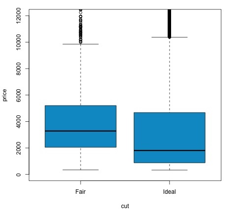
# Another way to validate the previous results is to just plot the
distributions using a box-plot
plot(price ~ cut, data = data, ylim = c(0,12000),
col = 'deepskyblue3')
我们可以通过检查 p 值是否低于 0.05 来分析测试结果。如果是这种情况,我们保留备择假设。这意味着我们发现了两个削减因子水平之间的价格差异。根据级别的名称,我们会期望这个结果,但我们不会期望失败组中的平均价格会高于理想组中的平均价格。我们可以通过比较每个因素的均值来看到这一点。
plot 命令生成一个图表,显示价格和切割变量之间的关系。这是一个箱线图;我们在 16.0.1 节中已经介绍了这个图,但它基本上显示了我们正在分析的两个切割水平的价格变量的分布。
方差分析
方差分析 (ANOVA) 是一种统计模型,用于通过比较各组的均值和方差来分析组分布之间的差异,该模型由 Ronald Fisher 开发。方差分析提供了几个组的均值是否相等的统计检验,因此将 t 检验推广到两个以上的组。
方差分析对于比较三个或更多组的统计显着性很有用,因为进行多个双样本 t 检验会增加发生第一类统计错误的机会。
在提供数学解释方面,需要以下内容来理解测试。
xij = x + (xi − x) + (xij-x)
这导致以下模型-
xij = μ + αi + ∈ij
其中 μ 是总均值,
αi 是第 i 组均值。误差项
∈ij 被假定为来自正态分布的 iid。检验的原假设是-
α1 = α2 = … = αk
在计算测试统计量方面,我们需要计算两个值-
组间差异的平方和-
$$SSD_B = \sum_{i}^{k} \sum_{j}^{n}(\bar{x_{\bar{i}}}-\bar{x})^2$$
组内平方和
$$SSD_W = \sum_{i}^{k} \sum_{j}^{n}(\bar{x_{\bar{ij}}}-\bar{x_{\bar{i}} })^2$$
其中 SSD
B 的自由度为 k-1,SSD
W 的自由度为 N-k。然后我们可以定义每个度量的均方差。
MSB = SSDB/(k-1)
MSw = SSDw/(N-k)
最后,ANOVA中的检验统计量定义为上述两个量的比值
F = MSB/MSw
遵循具有
k−1 和
N−k 自由度的 F 分布。如果原假设为真,则 F 可能接近 1、否则,组间均方 MSB 可能很大,从而导致 F 值很大。
基本上,方差分析会检查总方差的两个来源,并查看哪一部分贡献更大。这就是为什么它被称为方差分析,尽管其目的是比较组均值。
在计算统计量方面,在 R 中实际上相当简单。以下示例将演示如何完成并绘制结果。
library(ggplot2)
# We will be using the mtcars dataset
head(mtcars)
#                    mpg  cyl disp  hp drat  wt  qsec   vs am  gear carb
# Mazda RX4         21.0   6  160 110 3.90 2.620 16.46  0  1    4    4
# Mazda RX4 Wag     21.0   6  160 110 3.90 2.875 17.02  0  1    4    4
# Datsun 710        22.8   4  108  93 3.85 2.320 18.61  1  1    4    1
# Hornet 4 Drive    21.4   6  258 110 3.08 3.215 19.44  1  0    3    1
# Hornet Sportabout 18.7   8  360 175 3.15 3.440 17.02  0  0    3    2
# Valiant           18.1   6  225 105 2.76 3.460 20.22  1  0    3    1
# Let's see if there are differences between the groups of cyl in the mpg variable.
data = mtcars[, c('mpg', 'cyl')]
fit = lm(mpg ~ cyl, data = mtcars)
anova(fit)
# Analysis of Variance Table
# Response: mpg
#           Df Sum Sq Mean Sq F value    Pr(>F)
# cyl        1 817.71  817.71  79.561 6.113e-10 ***
# Residuals 30 308.33   10.28
# Signif. codes:  0 *** 0.001 ** 0.01 * 0.05 .
# Plot the distribution
plot(mpg ~ as.factor(cyl), data = mtcars, col = 'deepskyblue3')
代码将产生以下输出-
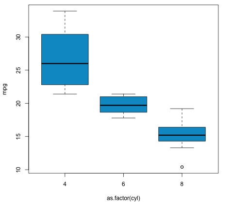
我们在示例中得到的 p 值明显小于 0.05,因此 R 返回符号"***"来表示这一点。这意味着我们拒绝原假设,并且我们发现
cyl 变量的不同组之间 mpg 均值之间存在差异。