数据分析 数据探索
探索性数据分析是由 John Tuckey (1977) 提出的一个概念,它包含一个新的统计视角。 Tuckey 的想法是,在传统的统计中,数据不是以图形方式探索的,只是用来检验假设。第一次开发工具的尝试是在斯坦福完成的,该项目名为 prim9、该工具能够在九个维度上可视化数据,因此能够提供数据的多元视角。
最近几天,探索性数据分析必不可少,并已被纳入大数据分析生命周期。强大的 EDA 功能可以促进发现洞察力并能够在组织中有效地传达洞察力的能力。
基于 Tuckey 的想法,贝尔实验室开发了
S 编程语言,以便为进行统计提供交互式界面。 S 的想法是通过易于使用的语言提供广泛的图形功能。在当今世界,在大数据背景下,基于
S 编程语言的
R 是最流行的分析软件。
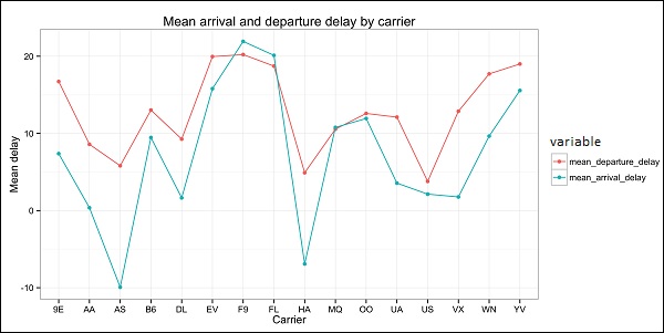
以下程序演示了探索性数据分析的使用。
以下是探索性数据分析的示例。此代码也可在
part1/eda/exploratory_data_analysis.R 文件中找到。
library(nycflights13)
library(ggplot2)
library(data.table)
library(reshape2)
# Using the code from the previous section
# this computes the mean arrival and departure delays by carrier.
DT <-as.data.table(flights)
mean2 = DT[, list(mean_departure_delay = mean(dep_delay, na.rm = true),
   mean_arrival_delay = mean(arr_delay, na.rm = true)),
   by = carrier]
# In order to plot data in R usign ggplot, it is normally needed to reshape the data
# We want to have the data in long format for plotting with ggplot
dt = melt(mean2, id.vars = ’carrier’)
# Take a look at the first rows
print(head(dt))
# Take a look at the help for ?geom_point and geom_line to find similar examples
# Here we take the carrier code as the x axis
# the value from the dt data.table goes in the y axis
# The variable column represents the color
p = ggplot(dt, aes(x = carrier, y = value, color = variable, group = variable)) +
   geom_point() + # Plots points
   geom_line() + # Plots lines
   theme_bw() + # Uses a white background
   labs(list(title = 'Mean arrival and departure delay by carrier',
      x = 'Carrier', y = 'Mean delay'))
print(p)
# Save the plot to disk
ggsave('mean_delay_by_carrier.png', p,
   width = 10.4, height = 5.07)
代码应生成如下图像-