数据分析 数据可视化
为了理解数据,将数据可视化通常很有用。通常在大数据应用程序中,兴趣依赖于发现洞察力,而不仅仅是制作漂亮的图表。以下是使用绘图理解数据的不同方法的示例。
要开始分析航班数据,我们可以先检查数值变量之间是否存在相关性。此代码也可在
bda/part1/data_visualization/data_visualization.R 文件中找到。
# Install the package corrplot by running
install.packages('corrplot')
# then load the library
library(corrplot)
# Load the following libraries
library(nycflights13)
library(ggplot2)
library(data.table)
library(reshape2)
# We will continue working with the flights data
DT <-as.data.table(flights)
head(DT) # take a look
# We select the numeric variables after inspecting the first rows.
numeric_variables = c('dep_time', 'dep_delay',
   'arr_time', 'arr_delay', 'air_time', 'distance')
# Select numeric variables from the DT data.table
dt_num = DT[, numeric_variables, with = false]
# Compute the correlation matrix of dt_num
cor_mat = cor(dt_num, use = "complete.obs")
print(cor_mat)
### Here is the correlation matrix
#              dep_time   dep_delay   arr_time   arr_delay    air_time    distance
# dep_time   1.00000000  0.25961272 0.66250900  0.23230573-0.01461948-0.01413373
# dep_delay  0.25961272  1.00000000 0.02942101  0.91480276-0.02240508-0.02168090
# arr_time   0.66250900  0.02942101 1.00000000  0.02448214  0.05429603  0.04718917
# arr_delay  0.23230573  0.91480276 0.02448214  1.00000000-0.03529709-0.06186776
# air_time -0.01461948-0.02240508 0.05429603-0.03529709  1.00000000  0.99064965
# distance -0.01413373-0.02168090 0.04718917-0.06186776  0.99064965  1.00000000
# We can display it visually to get a better understanding of the data
corrplot.mixed(cor_mat, lower = "circle", upper = "ellipse")
# save it to disk
png('corrplot.png')
print(corrplot.mixed(cor_mat, lower = "circle", upper = "ellipse"))
dev.off()
此代码生成以下相关矩阵可视化-
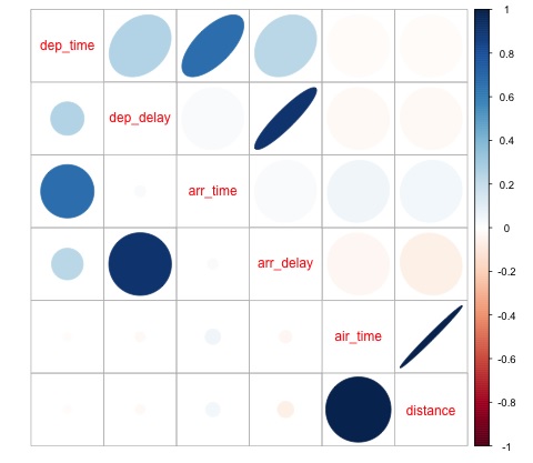
我们可以在图中看到数据集中的一些变量之间存在很强的相关性。例如,到达延误和出发延误似乎高度相关。我们可以看到这一点,因为椭圆显示两个变量之间几乎呈线性关系,但要从这个结果中找出因果关系并不容易。
我们不能说两个变量是相关的,一个对另一个有影响。此外,我们在图中发现飞行时间和距离之间存在很强的相关性,这是相当合理的,因为距离越远,飞行时间就会增加。
我们还可以对数据进行单变量分析。
箱线图是一种简单而有效的可视化分布的方法。以下代码演示了如何使用 ggplot2 库生成箱线图和格状图。此代码也可在
bda/part1/data_visualization/boxplots.R 文件中找到。
source('data_visualization.R')
### Analyzing Distributions using box-plots
# The following shows the distance as a function of the carrier
p = ggplot(DT, aes(x = carrier, y = distance, fill = carrier)) + # Define the carrier
   in the x axis and distance in the y axis
   geom_box-plot() + # Use the box-plot geom
   theme_bw() + # Leave a white background-More in line with tufte's
      principles than the default
   guides(fill = false) + # Remove legend
   labs(list(title = 'Distance as a function of carrier', # Add labels
      x = 'Carrier', y = 'Distance'))
p
# Save to disk
png(‘boxplot_carrier.png’)
print(p)
dev.off()
# Let's add now another variable, the month of each flight
# We will be using facet_wrap for this
p = ggplot(DT, aes(carrier, distance, fill = carrier)) +
   geom_box-plot() +
   theme_bw() +
   guides(fill = false) +
   facet_wrap(~month) + # this creates the trellis plot with the by month variable
   labs(list(title = 'Distance as a function of carrier by month',
      x = 'Carrier', y = 'Distance'))
p
# The plot shows there aren't clear differences between distance in different months
# Save to disk
png('boxplot_carrier_by_month.png')
print(p)
dev.off()