Matplotlib提琴图
Matplotlib提琴图详细操作教程
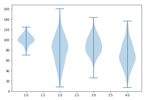
小提琴图类似于箱形图,除了它们还显示不同值的数据的概率密度。这些图包括数据中位数的标记和表示四分位数范围的框,如标准框图中所示。在该箱图上叠加的是核密度估计。与箱形图一样,小提琴图用于表示跨不同“类别”的可变分布(或样本分布)的比较。
小提琴图形比普通图形更具信息性。事实上,虽然箱形图仅显示平均值/中位数和四分位数范围等汇总统计量,但小提琴图显示了数据的完整分布。
# Filename : example.py
# Copyright : 2020 By Lidihuo
# Author by : www.lidihuo.com
# Date : 2020-08-24
import matplotlib.pyplot as plt
np.random.seed(10)
collectn_1 = np.random.normal(100, 10, 200)
collectn_2 = np.random.normal(80, 30, 200)
collectn_3 = np.random.normal(90, 20, 200)
collectn_4 = np.random.normal(70, 25, 200)
## combine these different collections into a list
data_to_plot = [collectn_1, collectn_2, collectn_3, collectn_4]
# Create a figure instance
fig = plt.figure()
# Create an axes instance
ax = fig.add_axes([0,0,1,1])
# Create the boxplot
bp = ax.violinplot(data_to_plot)
plt.show()
执行上面示例代码,得到以下结果: