Plotly 下拉菜单
Plotly 通过使用绘图区域上的不同控件(例如按钮、下拉菜单和滑块等)提供高度交互性。这些控件与绘图布局的
updatemenu 属性结合在一起。您可以通过指定要调用的方法来
添加按钮及其行为。
有四种可能的方法可以与一个按钮如下-
restyle-修改数据或数据属性
relayout-修改布局属性
update-修改数据和布局属性
animate-开始或暂停动画
修改图表的数据和数据属性时应使用
restyle方法。在以下示例中,通过
Updatemenu() 方法将两个按钮添加到使用
restyle 方法的布局中。
go.layout.Updatemenu(
type = "buttons",
direction = "left",
buttons = list([
   dict(args = ["type", "box"], label = "Box", method = "restyle"),
   dict(args = ["type", "violin"], label = "Violin", method = "restyle")]
))
type 属性的默认值为
buttons。要呈现按钮下拉列表,请将类型更改为
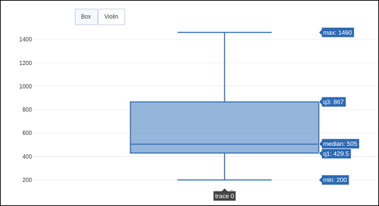
下拉。在更新其布局之前添加到 Figure 对象的 Box 跟踪如上。根据单击的按钮呈现
boxplot 和
violin plot 的完整代码如下-
import plotly.graph_objs as go
fig = go.Figure()
fig.add_trace(go.Box(y = [1140,1460,489,594,502,508,370,200]))
fig.layout.update(
   updatemenus = [
      go.layout.Updatemenu(
         type = "buttons", direction = "left", buttons=list(
            [
               dict(args = ["type", "box"], label = "Box", method = "restyle"),
               dict(args = ["type", "violin"], label = "Violin", method = "restyle")
            ]
         ),
         pad = {"r": 2, "t": 2},
         showactive = true,
         x = 0.11,
         xanchor = "left",
         y = 1.1,
         yanchor = "top"
      ),
   ]
)
iplot(fig)
代码的输出如下-
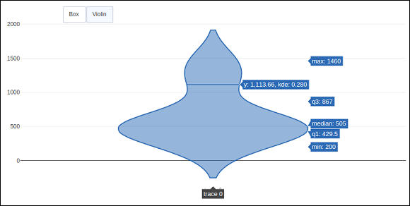
点击
小提琴按钮显示相应的
小提琴图。
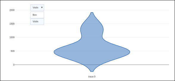
如上所述,
Updatemenu() 方法中
type 键的值被分配给
dropdown 以显示按钮的下拉列表。该图如下所示-
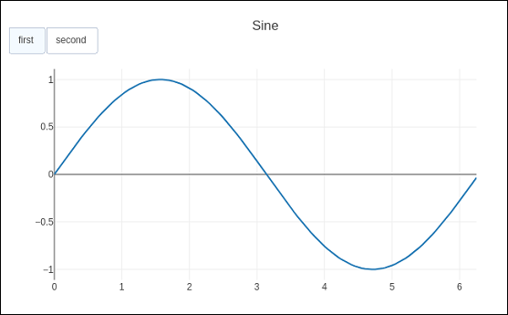
修改图表的数据和布局部分时应使用
update 方法。以下示例演示了如何在更新布局属性(例如图表标题)的同时更新以及显示哪些跟踪。
正弦波和余弦波对应的两条Scatter轨迹被添加到
图形对象。可见
属性为
True的迹线将显示在图上,其他迹线将被隐藏。
import numpy as np
import math #needed for definition of pi
xpoints = np.arange(0, math.pi*2, 0.05)
y1 = np.sin(xpoints)
y2 = np.cos(xpoints)
fig = go.Figure()
# Add Traces
fig.add_trace(
   go.Scatter(
      x = xpoints, y = y1, name = 'Sine'
   )
)
fig.add_trace(
   go.Scatter(
      x = xpoints, y = y2, name = 'cos'
   )
)
fig.layout.update(
   updatemenus = [
      go.layout.Updatemenu(
         type = "buttons", direction = "right", active = 0, x = 0.1, y = 1.2,
         buttons = list(
            [
               dict(
                  label = "first", method = "update",
                  args = [{"visible": [True, false]},{"title": "Sine"} ]
               ),
               dict(
                  label = "second", method = "update",
                  args = [{"visible": [False, true]},{"title": Cos"}]
               )
            ]
         )
      )
   ]
)
iplot(fig)
最初,将显示
正弦曲线。如果点击第二个按钮,
cos trace 出现。
请注意,
图表标题也会相应更新。
为了使用
animate方法,我们需要添加一个或多个
Frames到Figure对象。与数据和布局一起,框架可以添加为图形对象中的键。帧键指向一个图形列表,当动画被触发时,每个图形都会循环显示。
您可以通过向布局添加
更新菜单数组来添加、播放和暂停按钮以在图表中引入动画。
"updatemenus": [{
   "type": "buttons", "buttons": [{
      "label": "Your Label", "method": "animate", "args": [frames]
   }]
}]
在以下示例中,首先绘制了
散点曲线 轨迹。然后添加
frames,它是
50 个 Frame 对象 的列表,每个对象代表曲线上的一个
红色标记。请注意,按钮的
args 属性设置为 None,因此所有帧都具有动画效果。
import numpy as np
t = np.linspace(-1, 1, 100)
x = t + t ** 2
y = t-t ** 2
xm = np.min(x)-1.5
xM = np.max(x) + 1.5
ym = np.min(y)-1.5
yM = np.max(y) + 1.5
N = 50
s = np.linspace(-1, 1, N)
#s = np.arange(0, math.pi*2, 0.1)
xx = s + s ** 2
yy = s-s ** 2
fig = go.Figure(
   data = [
      go.Scatter(x = x, y = y, mode = "lines", line = dict(width = 2, color = "blue")),
      go.Scatter(x = x, y = y, mode = "lines", line = dict(width = 2, color = "blue"))
   ],
   layout = go.Layout(
      xaxis=dict(range=[xm, xM], autorange=False, zeroline=False),
      yaxis=dict(range=[ym, yM], autorange=False, zeroline=False),
      title_text="Moving marker on curve",
      updatemenus=[
         dict(type="buttons", buttons=[dict(label="Play", method="animate", args=[None])])
      ]
   ),
   frames = [go.Frame(
      data = [
            go.Scatter(
            x = [xx[k]], y = [yy[k]], mode = "markers", marker = dict(
               color = "red", size = 10
            )
         )
      ]
   )
   for k in range(N)]
)
iplot(fig)
代码的输出如下-
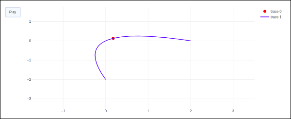
点击
播放按钮后,红色标记将开始沿曲线移动。