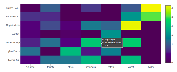
vegetables = [
   "cucumber",
   "tomato",
   "lettuce",
   "asparagus",
   "potato",
   "wheat",
   "barley"
]
farmers = [
   "Farmer Joe",
   "Upland Bros.",
   "Smith Gardening",
   "Agrifun",
   "Organiculture",
   "BioGoods Ltd.",
   "Cornylee Corp."
]
harvest = np.array(
   [
      [0.8, 2.4, 2.5, 3.9, 0.0, 4.0, 0.0],
      [2.4, 0.0, 4.0, 1.0, 2.7, 0.0, 0.0],
      [1.1, 2.4, 0.8, 4.3, 1.9, 4.4, 0.0],
      [0.6, 0.0, 0.3, 0.0, 3.1, 0.0, 0.0],
      [0.7, 1.7, 0.6, 2.6, 2.2, 6.2, 0.0],
      [1.3, 1.2, 0.0, 0.0, 0.0, 3.2, 5.1],
      [0.1, 2.0, 0.0, 1.4, 0.0, 1.9, 6.3]
   ]
)
trace = go.Heatmap(
   x = vegetables,
   y = farmers,
   z = harvest,
   type = 'heatmap',
   colorscale = 'Viridis'
)
data = [trace]
fig = go.Figure(data = data)
iplot(fig)