CSS 箭头
CSS箭头用于添加带有工具提示的数组。它使工具提示像气泡一样。也可以用四种方式表示:
顶部箭头
底部箭头
左箭头
向右箭头
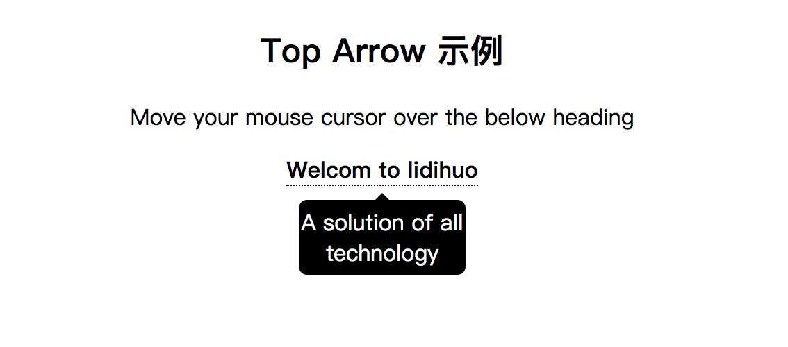
CSS顶部箭头
当您将鼠标光标移到元素上方时,顶部箭头用于在工具提示的顶部添加类似箭头的结构。它将在元素底部显示工具提示。
请参见以下示例:
<!DOCTYPE html>
<html>
<style>
.tooltip {
position: relative;
display: inline-block;
border-bottom: 1px dotted black;
}
.tooltip .tooltiptext {
visibility: hidden;
width: 120px;
background-color: black;
color: #fff;
text-align: center;
border-radius: 6px;
padding: 5px 0;
position: absolute;
z-index: 1;
top: 150%;
left: 50%;
margin-left: -60px;
}
.tooltip .tooltiptext::after {
content: "";
position: absolute;
bottom: 100%;
left: 50%;
margin-left: -5px;
border-width: 5px;
border-style: solid;
border-color: transparent transparent black transparent;
}
.tooltip:hover .tooltiptext {
visibility: visible;
}
</style>
<body style="text-align:center;">
<h2>Top Arrow 示例</h2>
<p>Move your mouse cursor over the below heading</p>
<div class="tooltip"><strong>Welcom to lidihuo</strong>
<span class="tooltiptext">A solution of all technology</span>
</div>
</body>
</html>
输出
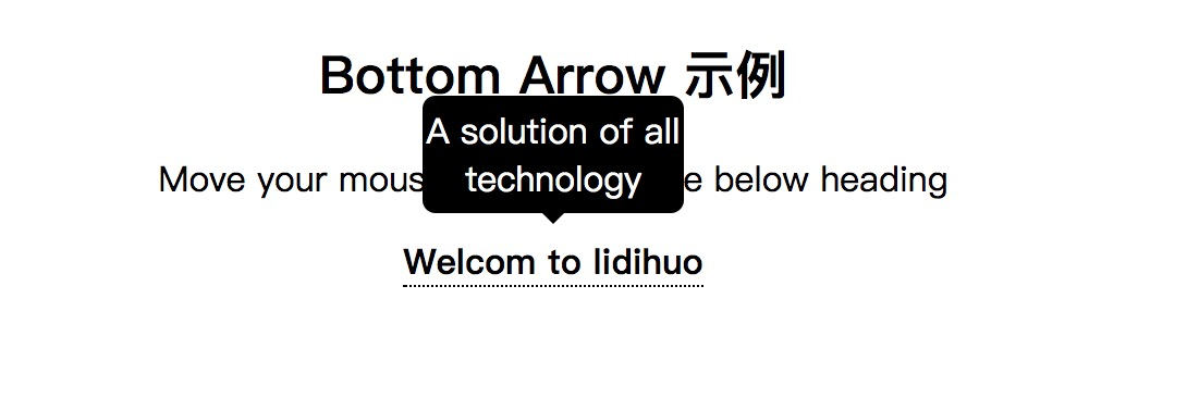
CSS底部箭头
当您将鼠标光标移到元素上方时,底部箭头用于在工具提示的底部添加类似箭头的结构。它将在元素顶部显示工具提示。
请参见以下示例:
<!DOCTYPE html>
<html>
<style>
.tooltip {
position: relative;
display: inline-block;
border-bottom: 1px dotted black;
}
.tooltip .tooltiptext {
visibility: hidden;
width: 120px;
background-color: black;
color: #fff;
text-align: center;
border-radius: 6px;
padding: 5px 0;
position: absolute;
z-index: 1;
bottom: 150%;
left: 50%;
margin-left: -60px;
}
.tooltip .tooltiptext::after {
content: "";
position: absolute;
top: 100%;
left: 50%;
margin-left: -5px;
border-width: 5px;
border-style: solid;
border-color: black transparent transparent transparent;
}
.tooltip:hover .tooltiptext {
visibility: visible;
}
</style>
<body style="text-align:center;">
<h2>Bottom Arrow 示例</h2>
<p>Move your mouse cursor over the below heading</p>
<div class="tooltip"><strong>Welcom to lidihuo</strong>
<span class="tooltiptext">A solution of all technology</span>
</div>
</body>
</html>
输出
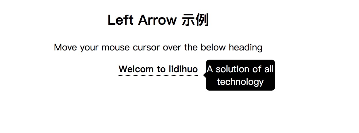
CSS左箭头
当您将鼠标光标移到元素上方时,左箭头用于在工具提示的左侧添加类似箭头的结构。它将在元素的右侧显示工具提示。
请参见以下示例:
<!DOCTYPE html>
<html>
<style>
.tooltip {
position: relative;
display: inline-block;
border-bottom: 1px dotted black;
}
.tooltip .tooltiptext {
visibility: hidden;
width: 120px;
background-color: black;
color: #fff;
text-align: center;
border-radius: 6px;
padding: 5px 0;
position: absolute;
z-index: 1;
top: -5px;
left: 110%;
}
.tooltip .tooltiptext::after {
content: "";
position: absolute;
top: 50%;
right: 100%;
margin-top: -5px;
border-width: 5px;
border-style: solid;
border-color: transparent black transparent transparent;
}
.tooltip:hover .tooltiptext {
visibility: visible;
}
</style>
<body style="text-align:center;">
<h2>Left Arrow 示例</h2>
<p>Move your mouse cursor over the below heading</p>
<div class="tooltip"><strong>Welcom to lidihuo</strong>
<span class="tooltiptext">A solution of all technology</span>
</div>
</body>
</html>
输出
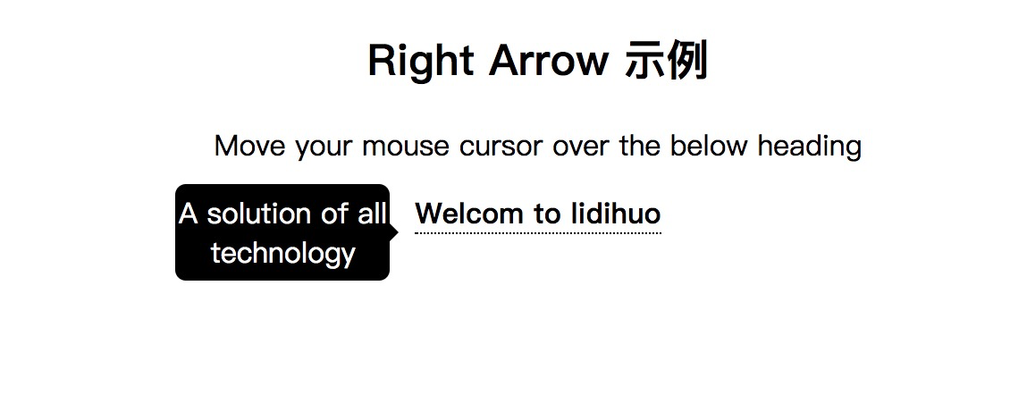
CSS右箭头
当您将鼠标光标移到元素上方时,右箭头用于在工具提示的右侧添加类似箭头的结构。它将在元素的左侧显示工具提示。
请参见以下示例:
<!DOCTYPE html>
<html>
<style>
.tooltip {
position: relative;
display: inline-block;
border-bottom: 1px dotted black;
}
.tooltip .tooltiptext {
visibility: hidden;
width: 120px;
background-color: black;
color: #fff;
text-align: center;
border-radius: 6px;
padding: 5px 0;
position: absolute;
z-index: 1;
top: -5px;
right: 110%;
}
.tooltip .tooltiptext::after {
content: "";
position: absolute;
top: 50%;
left: 100%;
margin-top: -5px;
border-width: 5px;
border-style: solid;
border-color: transparent transparent transparent black;
}
.tooltip:hover .tooltiptext {
visibility: visible;
}
</style>
<body style="text-align:center;">
<h2>Right Arrow 示例</h2>
<p>Move your mouse cursor over the below heading</p>
<div class="tooltip"><strong>Welcom to lidihuo</strong>
<span class="tooltiptext">A solution of all technology</span>
</div>
</body>
</html>
输出

