CSS @keyframes规则
CSS @keyframe指定了动画规则,该规则定义了每个状态下具有时间轴的元素的CSS属性。
我们可以使用
@keyframe 来创建复杂的动画属性。使用可变的CSS样式创建动画,该样式可以无限重复或无限次重复。一个简单的动画只能有两个关键帧,而复杂的动画只有几个关键帧。
语法
@keyframes animation-name {keyframes-selector {css-styles;}}
要使用关键帧,我们需要创建一个
@keyframes 规则以及
animation-name 属性,以使动画与其关键帧声明相匹配。
它接受三个值。让我们详细讨论它们。
属性值
animation-name:这是必需的值,它定义了
keyframes-selector::指定关键帧发生时动画的百分比。其值介于(等于0%)到(等于100%)的0%到100%之间。关键帧百分比可以按任何顺序编写,因为它们将按照出现的顺序进行处理。
css-styles:。它定义了一个或多个CSS样式属性。
如果关键帧规则未定义动画的开始和结束状态,则浏览器将使用元素的现有样式。这些属性将被忽略,无法在关键帧规则中进行动画处理。
关键帧计时功能
为控制动画速率,我们可以使用以下值。
匀速:表示从开始到结束的过渡速率是恒定的。
变速:表示动画开始缓慢,然后经过一段时间后,速度会提高,并且在结束速度之前会再次降低。
缓入:这类似于缓和,但是动画很快结束。
缓动:它也与缓动类似,但是动画开始很快。
让我们尝试通过一些方法来了解CSS @keyframe规则。插图。
示例
<!DOCTYPE html>
<html>
<head>
<style>
div
{
width:200px;
height:200px;
animation:demo 5s ease-in infinite, trans 5s ease-in-out infinite;
border-radius:40px;
}
@keyframes demo
{
0% {background:red;}
50% {background:yellow; width:100px; height:100px;}
100% {background:green; width:300px; height:300px;}
}
@keyframes trans
{
0% {transform:translate(0px) scale(1.4) rotate(80deg);}
50% {transform:translate(250px) scale(1.2) rotate(40deg);}
100% {transform:translate(350px) scale(1) rotate(0deg);}
}
</style>
</head>
<body>
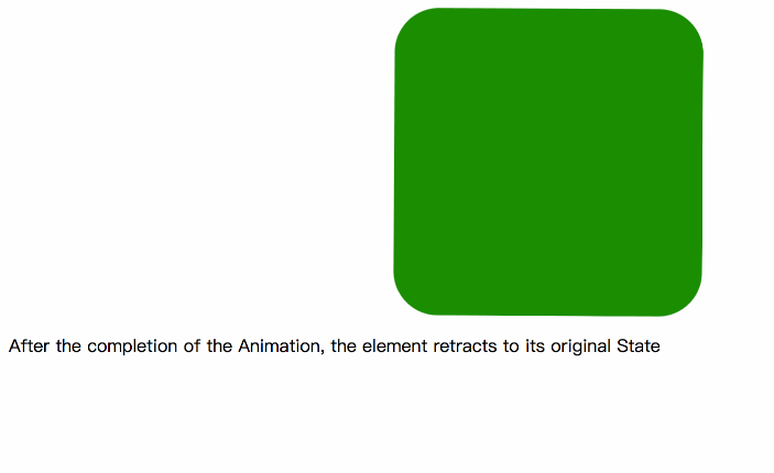
<div></div>
<p>After the completion of the Animation, the element retracts to its original State </p>
</body>
</html>
输出
Example2
<!DOCTYPE html>
<html>
<head>
<style>
h1 {
color: black;
text-align: center;
}
div {
position: relative;
animation: jtp 7s infinite;
}
@keyframes jtp {
0% {
top: 500px;
width: 0px;
font-size:10px;
transform: translate(0px) scale(1.4) rotate(80deg);
}
25% {
top: 400px;
background: yellow;
font-size:20px;
width: 50px;
transform: translate(100px) scale(1.3) rotate(60deg);
}
50% {
top: 300px;
background: orange;
font-size:30px;
width: 150px;
transform: translate(200px) scale(1.2) rotate(40deg);
}
75% {
top: 200px;
background: pink;
width: 250px;
font-size:40px;
transform: translate(300px) scale(1.1) rotate(20deg);
}
100% {
top: 100px;
background: red;
font-size:50px;
width: 500px;
transform: translate(400px) scale(1) rotate(0deg);
}
}
</style>
</head>
<body>
<div>
<h1>lidihuo</h1>
</div>
</body>
</html>
输出

要记住的要点
有关此规则的一些重要要点如下:
我们可以使用 from 关键字来代替 0%。
我们可以使用to关键字,而不使用 100%。
即使我们使用 from 和 to 关键字,它们之间的任何值仍将以%声明。
对于有效的动画,必须声明开始和结束时间。
那些涉及!important 的声明将被忽略。

