CSS flex-shrink
CSS
flex-shrink 属性指定一个项目将比容器中其他项目收缩多少。它设置了弹性项目的弹性收缩系数(一个数字,用于确定弹性项目将收缩多少)。
我们可以在各个弹性项目之间分配负空间,以便某些项目比其他人拥有更多的负面空间。可以通过将
flex-shrink 属性的值设置为
2 来完成。因此,具有
flex-shrink: 2; 的flex-item将比
flex-shrink: 1; 收缩两倍,即,它所占的负空间是其两倍。其他。
flex-shrink 的值越高,则导致该项目比其他项目收缩得越多。
分配负空间时,flex收缩因子会乘以flex-basis。
flex-basis 是项目的初始大小。
它仅适用于flex-item,因此,如果容器中的项目不是flex-item,则
flex-shrink 属性不会影响相应的项目。通常,此
CSS 属性与
flex-grow 和< strong> flex-basis ,通常由flex简化为确保已设置所有值。
语法
flex-shrink: number| initial | inherit;
值
number:它是确定弯曲收缩率的正数。其默认值为1,表示默认情况下项目不会收缩。不允许为负值。此值指定该项目与其他柔性项目相比将收缩多少。
initial::将此属性设置为其默认值。
inherit:。该属性从其父元素继承。
示例
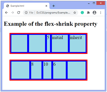
在此示例中,有两个容器,每个容器有五个flex-项目。容器的
宽度和
高度是
400px 和
100px 。
在第一个容器,我们将
flex-shrink: 5; 应用于第三项,将
flex-shrink: initial; 应用于第四项,并将
flex-shrink: Inherit ; 应用于第五项。
在第二个容器中,将
flex-shrink: 8; 应用于第二项,
flex-shrink: 10; 到第三项,
flex-shrink: 6; 到第四项。
<!DOCTYPE html>
<html>
<head>
<style>
.container {
width: 400px;
height: 100px;
border: 5px solid red;
display: flex;
background-color: blue;
margin: 30px;
}
.flex-item{
background-color: lightblue;
font-size: 25px;
margin: 5px;
flex-grow: 1;
flex-shrink: 1;
flex-basis: 100px;
}
</style>
</head>
<body>
<h1> 示例 of the flex-shrink property </h1>
<div class="container">
<div class = "flex-item"></div>
<div class = "flex-item"></div>
<div class = "flex-item" style = "flex-shrink: 5;"> 5 </div>
<div class = "flex-item" style = "flex-shrink: initial;"> initial </div>
<div class = "flex-item" style = "flex-shrink: inherit;"> inherit </div>
</div>
<div class="container">
<div class = "flex-item"></div>
<div class = "flex-item" style = "flex-shrink: 8;"> 8 </div>
<div class = "flex-item" style = "flex-shrink: 10;"> 10 </div>
<div class = "flex-item" style = "flex-shrink: 6;"> 6 </div>
<div class = "flex-item"></div>
</div>
</body>
</html>
输出
让我们看看
flex-shrink 属性的另一个示例。
示例
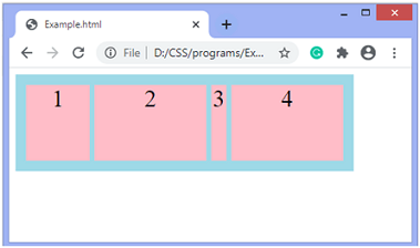
在此示例中,有一个容器,其中有五个弹性项目。容器的
宽度和
高度是
400px 和
100px 。我们将
flex-shrink 属性应用于其中两个项目将比其他项目占用更多的负空间。弹性项目的
flex-basis 的值为
150px 。
<!DOCTYPE html>
<html>
<head>
<style>
.container {
width: 400px;
height: 100px;
padding: 10px;
display: flex;
background-color: lightblue;
}
.flex-item {
background-color: pink;
margin: 3px;
text-align: center;
font-size: 30px;
flex-basis: 150px;
flex-grow: 0;
}
</style>
</head>
<body>
<div class="container">
<div class="flex-item" style = "flex-shrink: 3;"> 1 </div>
<div class="flex-item" > 2 </div>
<div class="flex-item" style = "flex-shrink: 5;" > 3 </div>
<div class="flex-item" > 4 </div>
<div class="flex-item" > 5 </div>
</div>
</body>
</html>
输出

