CSS cubic-bezier()
这是CSS中的内置函数,用于定义三次贝塞尔曲线。贝塞尔曲线是在2D图形应用程序(如墨水空间,adobe illustrator等)中使用的数学定义的曲线。此CSS函数是过渡计时功能,用于平滑和自定义过渡。
由四个点(即P0,P1,P2和P3)定义。点P0和P3(称为
anchors )是起点和终点,点P1和P2(称为
handles )是中间点。
对于CSS Bezier曲线,点P0和P3始终位于同一位置。 P0在(0,0)处代表初始状态和初始时间,P3在(1,1)处代表最终状态和最终时间。这意味着传递给cubic-bezier()函数的参数只能在0和1之间。
语法
cubic-bezier( x1, y1, x2, y2 )
此CSS函数接受四个必需的数字值。 x1和x2的值必须介于0和1之间,否则该值将无效。如果我们传递的参数不在此间隔内,则该函数将设置为默认值,即具有值
cubic-bezier(0,0,1,1)的线性过渡。
示例
此功能可以与
动画定时功能和
转换定时功能属性一起使用。
此处,我们正在使用
transition-timing-function 过渡属性。
<!DOCTYPE html>
<html>
<head>
<title> cubic-bezier() function </title>
<style>
.jtp {
width: 200px;
height: 50px;
background: blue;
transition: width 3s;
animation-timing-function: cubic-bezier(.59,1.01,0,.01)
}
div:hover {
width:300px;
}
p{
font-size: 20px;
color: darkviolet;
}
</style>
</head>
<body>
<h1> The cubic-bezier() Function </h1>
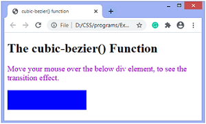
<p> Move your mouse over the below div element, to see the transition effect. </p>
<div class = "jtp">
</div>
</body>
</html>
输出

