CSS 加载等待
CSS 加载等待可以是任何一种动画,它可以告诉访问者该页面正在加载,您要等待几秒钟。当页面花费几秒钟来加载网页内容时,这将很有帮助。如果不使用网页上的加载程序,访问者可能会认为该站点没有响应。
使用
CSS loader使访问者分心或等待一段时间,直到页面完全加载。
我们可以通过以下插图来理解CSS loader的概念。
示例1
<!DOCTYPE html>
<html>
<head>
<title>css loader</title>
<style>
h1{
color:red;
}
div{
display: block;
position: absolute;
width: 10px;
height: 10px;
left: calc(50% - 1em);
border-radius: 1em;
transform-origin: 1em 2em;
animation: rotate;
animation-iteration-count: infinite;
animation-duration: 1.6s;
}
@keyframes rotate {
0% { transform: rotate(0deg); }
100% { transform: rotate(360deg); }
}
.d1 {
animation-delay: 0.1s;
background-color: blue;
}
.d2 {
animation-delay: 0.2s;
background-color: red;
}
.d3 {
animation-delay: 0.3s;
background-color: yellow;
}
.d4 {
animation-delay: 0.4s;
background-color: green;
}
.d5 {
animation-delay: 0.5s;
background-color: magenta;
}
</style>
</head>
<body>
<center>
<h1>CSS Loader</h1>
<div class='d1'></div>
<div class='d2'></div>
<div class='d3'></div>
<div class='d4'></div>
<div class='d5'></div>
</center>
</body>
</html>
输出

示例2
<!DOCTYPE html>
<html>
<head>
<style>
h1{
text-align:center;
}
.loader {
border: 20px solid #f3f3f3;
position:absolute;
left:43%;
border-radius: 50%;
border-top: 20px solid purple;
width: 150px;
height: 150px;
animation: spin 2s linear infinite;
}
@keyframes spin {
0% { transform: rotate(0deg); }
100% { transform: rotate(360deg); }
}
</style>
</head>
<body>
<h1>CSS Loader</h1>
<div class="loader"></div>
</body>
</html>
输出

在上面的示例中,我们定义了
border 属性,该属性指定加载程序的边框颜色和边框大小。在这里,我们还使用了
border-radius 属性,该属性将边框转换为圆形。
我们将
border-top 属性用于在边界内旋转的紫色东西。加载器的大小是通过
width 和
height 属性定义的。最后,我们添加了一个动画,使紫色物体以2s的动画速度旋转了无数次。
下面给出了更多加载的示例。
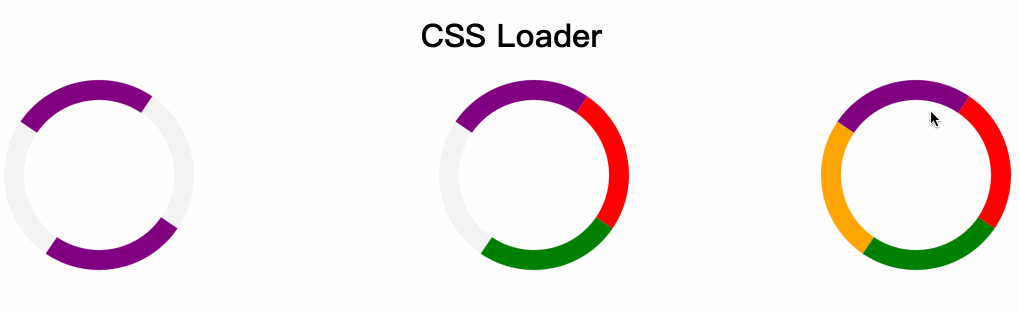
示例3
在上面的示例中,我们仅包含了
border-top 属性,但在此示例中,我们还包含了
border-bottom,border- 和
border-right 属性。
让我们看看它的工作原理。
<!DOCTYPE html>
<html>
<head>
<style>
h1{
text-align:center;
}
.loader {
border: 20px solid #f3f3f3;
position:absolute;
border-radius: 50%;
border-top: 20px solid purple;
border-bottom: 20px solid purple;
width: 150px;
height: 150px;
animation: spin 2s linear infinite;
}
.loader1 {
border: 20px solid #f3f3f3;
position:absolute;
left:43%;
border-radius: 50%;
border-top: 20px solid purple;
border-bottom: 20px solid green;
border-right: 20px solid red;
width: 150px;
height: 150px;
animation: spin 2s linear infinite;
}
.loader2 {
border: 20px solid #f3f3f3;
position:absolute;
left:80%;
border-radius: 50%;
border-top: 20px solid purple;
border-bottom: 20px solid green;
border-right: 20px solid red;
border-left:20px solid orange;
width: 150px;
height: 150px;
animation: spin 2s linear infinite;
}
@keyframes spin {
0% { transform: rotate(0deg); }
100% { transform: rotate(360deg); }
}
</style>
</head>
<body>
<h1>CSS Loader</h1>
<div class="loader"></div>
<div class="loader1"></div>
<div class="loader2"></div>
</body>
</html>
输出

