CSS background-blend-mode
CSS background-blend-mode
此CSS属性为元素的每个背景层(图像/颜色)设置混合模式。它定义了元素的背景图像如何与元素的背景颜色融合。我们可以将背景图像混合在一起,也可以与背景颜色混合。
Edge/Internet Explorer不支持此属性。
语法
background-blend-mode: normal | multiply | screen | color-dodge | difference | darken | lighten | saturation | luminosity | overlay | hard-light | soft-light | exclusion | hue | color-burn | color;
此属性具有许多属性值。让我们以每个示例为例讨论上述混合模式。
normal
这是将属性模式设置为普通的默认值。
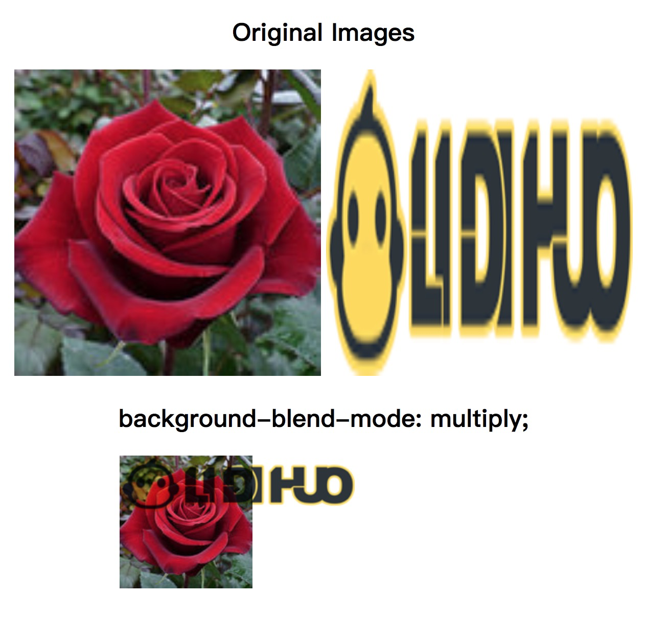
multiply
它将背景颜色和背景图像相乘,从而产生比以前更暗的图像。
示例
<!DOCTYPE html>
<html>
<head>
<style>
#div1 img {
width: 300px;
height: 300px;
}
#example {
width: 400px;
height: 400px;
background-repeat: no-repeat;
background-image: url("../uploads/html/rose.jpg"), url("../images/logo.png");
background-blend-mode: multiply;
}
</style>
</head>
<body>
<center>
<div id="div1">
<h2> Original Images </h2>
<img src="../uploads/html/rose.jpg">
<img src="../images/logo.png">
</div>
<h2> background-blend-mode: multiply; </h2>
<div id="example"></div>
</center>
</body>
</html>
输出
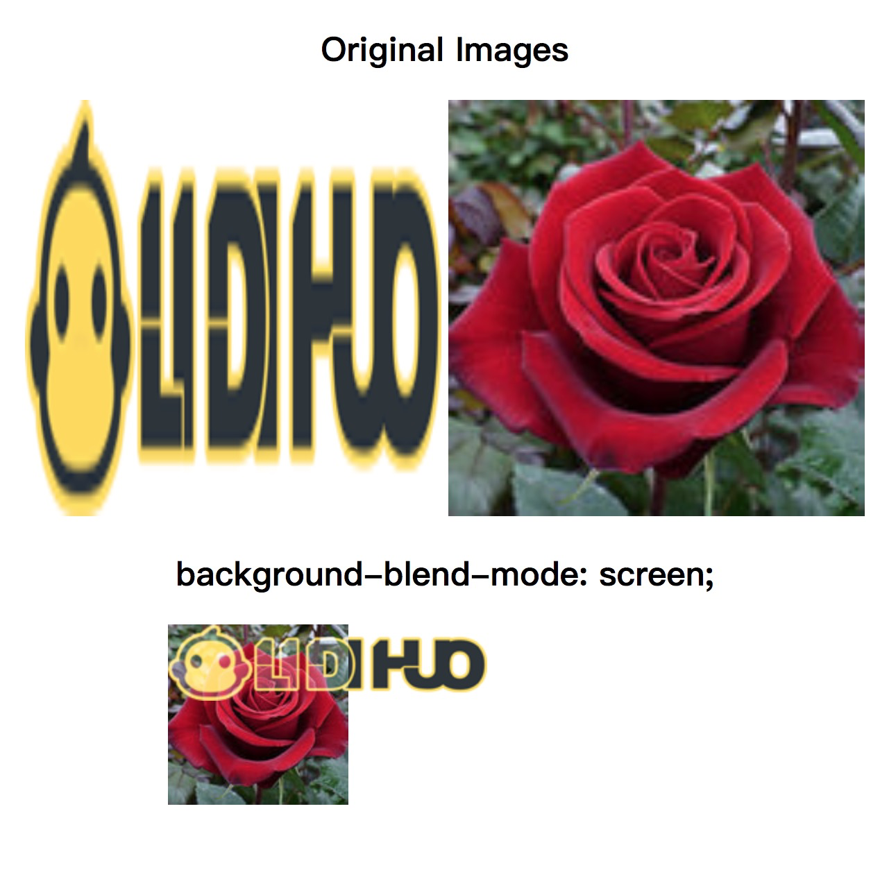
screen
用于将混合模式设置为屏幕并反转图像和颜色。这种效果就像在投影屏幕上显示两个图像。
示例
<!DOCTYPE html>
<html>
<head>
<style>
#div1 img{
width: 300px;
height: 300px;
}
#example{
width: 400px;
height: 400px;
background-repeat: no-repeat;
background-image: url("../images/logo.png"), url("../uploads/html/rose.jpg");
background-blend-mode: screen;
}
</style>
</head>
<body>
<center>
<div id = "div1">
<h2> Original Images </h2>
<img src = "../images/logo.png">
<img src = "../uploads/html/rose.jpg">
</div>
<h2> background-blend-mode: screen; </h2>
<div id="example"></div>
</center>
</body>
</html>
输出
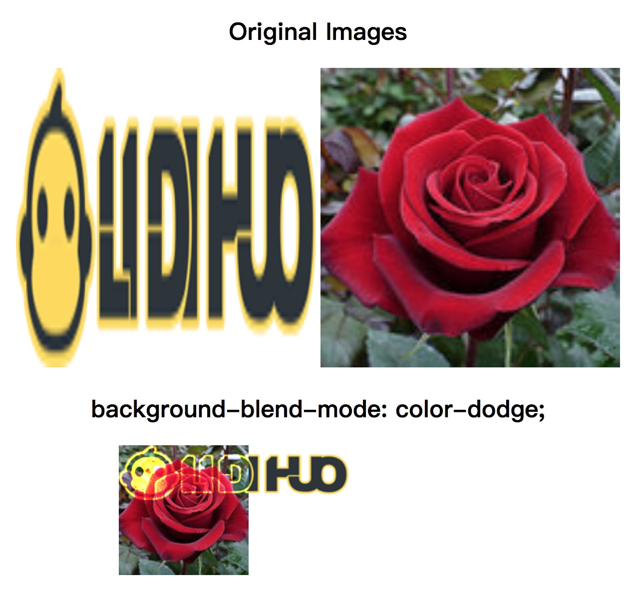
color-dodge
它类似于屏幕混合模式。用于将混合模式设置为减淡色。此模式的最终结果是将背景颜色除以背景图像的倒数的结果。
示例
<!DOCTYPE html>
<html>
<head>
<style>
#div1 img{
width: 300px;
height: 300px;
}
#example{
width: 400px;
height: 400px;
background-repeat: no-repeat;
background-image: url("../images/logo.png"), url("../uploads/html/rose.jpg");
background-blend-mode: color-dodge;
}
</style>
</head>
<body>
<center>
<div id = "div1">
<h2> Original Images </h2>
<img src = "../images/logo.png">
<img src = "../uploads/html/rose.jpg">
</div>
<h2> background-blend-mode: color-dodge; </h2>
<div id="example"></div>
</center>
</body>
</html>
输出
difference
用于将混合模式设置为差异。其最终结果是从最浅的颜色中减去深色的结果。
示例
<!DOCTYPE html>
<html>
<head>
<style>
#div1 img{
width: 300px;
height: 300px;
}
#example{
width: 400px;
height: 400px;
background-repeat: no-repeat;
background-image: url("../images/logo.png"), url("../uploads/html/rose.jpg");
background-blend-mode: difference;
}
</style>
</head>
<body>
<center>
<div id = "div1">
<h2> Original Images </h2>
<img src = "../images/logo.png">
<img src = "../uploads/html/rose.jpg">
</div>
<h2> background-blend-mode: difference; </h2>
<div id="example"></div>
</center>
</body>
</html>
输出

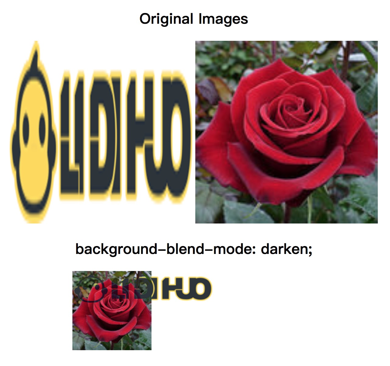
darken
用于将混合模式设置为变暗。
示例
<!DOCTYPE html>
<html>
<head>
<style>
#div1 img{
width: 300px;
height: 300px;
}
#example{
width: 400px;
height: 400px;
background-repeat: no-repeat;
background-image: url("../images/logo.png"), url("../uploads/html/rose.jpg");
background-blend-mode: darken;
}
</style>
</head>
<body>
<center>
<div id = "div1">
<h2> Original Images </h2>
<img src = "../images/logo.png">
<img src = "../uploads/html/rose.jpg">
</div>
<h2> background-blend-mode: darken; </h2>
<div id="example"></div>
</center>
</body>
</html>
输出
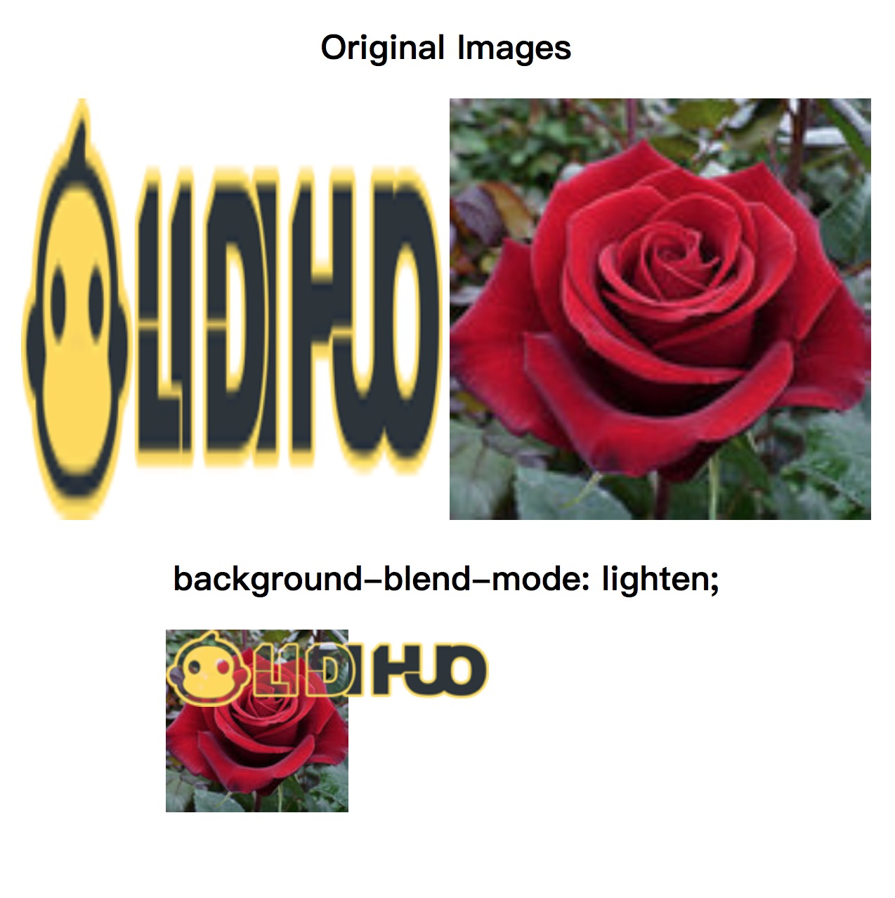
lighten
用于将混合模式设置为变亮。
示例
<!DOCTYPE html>
<html>
<head>
<style>
#div1 img{
width: 300px;
height: 300px;
}
#example{
width: 400px;
height: 400px;
background-repeat: no-repeat;
background-image: url("../images/logo.png"), url("../uploads/html/rose.jpg");
background-blend-mode: lighten;
}
</style>
</head>
<body>
<center>
<div id = "div1">
<h2> Original Images </h2>
<img src = "../images/logo.png">
<img src = "../uploads/html/rose.jpg">
</div>
<h2> background-blend-mode: lighten; </h2>
<div id="example"></div>
</center>
</body>
</html>
输出
Saturation
最终结果是顶部颜色的
saturation ,同时使用
hue 和
底色的光度。
示例
<!DOCTYPE html>
<html>
<head>
<style>
#div1 img{
width: 300px;
height: 300px;
}
#example{
width: 400px;
height: 400px;
background-repeat: no-repeat;
background-image: url("../images/logo.png"), url("../uploads/html/rose.jpg");
background-blend-mode: saturation;
}
</style>
</head>
<body>
<center>
<div id = "div1">
<h2> Original Images </h2>
<img src = "../images/logo.png">
<img src = "../uploads/html/rose.jpg">
</div>
<h2> background-blend-mode: saturation; </h2>
<div id="example"></div>
</center>
</body>
</html>
输出

luminosity
用于将混合模式设置为发光度。其最终结果是顶部颜色的
亮度,而使用底部颜色的
hue 和
saturation 。
示例
<!DOCTYPE html>
<html>
<head>
<style>
#div1 img{
width: 300px;
height: 300px;
}
#example{
width: 400px;
height: 400px;
background-repeat: no-repeat;
background-image: url("../images/logo.png"), url("../uploads/html/rose.jpg");
background-blend-mode: luminosity;
}
</style>
</head>
<body>
<center>
<div id = "div1">
<h2> Original Images </h2>
<img src = "../images/logo.png">
<img src = "../uploads/html/rose.jpg">
</div>
<h2> background-blend-mode: luminosity; </h2>
<div id="example"></div>
</center>
</body>
</html>
输出

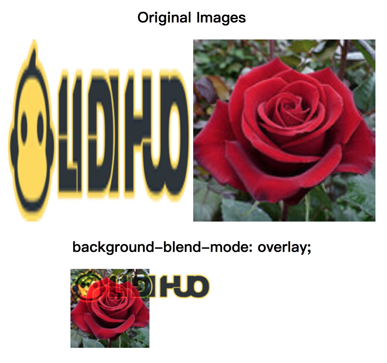
overlay
它用于设置混合模式为覆盖。
示例
<!DOCTYPE html>
<html>
<head>
<style>
#div1 img{
width: 300px;
height: 300px;
}
#example{
width: 400px;
height: 400px;
background-repeat: no-repeat;
background-image: url("../images/logo.png"), url("../uploads/html/rose.jpg");
background-blend-mode: overlay;
}
</style>
</head>
<body>
<center>
<div id = "div1">
<h2> Original Images </h2>
<img src = "../images/logo.png">
<img src = "../uploads/html/rose.jpg">
</div>
<h2> background-blend-mode: overlay; </h2>
<div id="example"></div>
</center>
</body>
</html>
输出
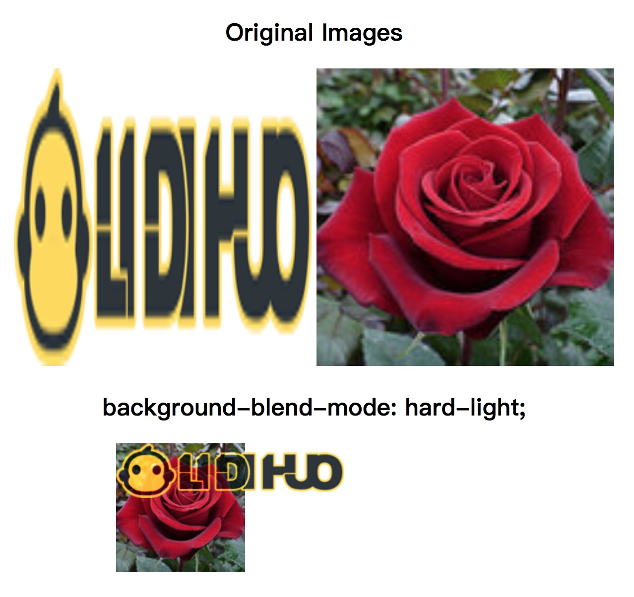
hard-light
用于将混合模式设置为强光。
示例
<!DOCTYPE html>
<html>
<head>
<style>
#div1 img{
width: 300px;
height: 300px;
}
#example{
width: 400px;
height: 400px;
background-repeat: no-repeat;
background-image: url("../images/logo.png"), url("../uploads/html/rose.jpg");
background-blend-mode: hard-light;
}
</style>
</head>
<body>
<center>
<div id = "div1">
<h2> Original Images </h2>
<img src = "../images/logo.png">
<img src = "../uploads/html/rose.jpg">
</div>
<h2> background-blend-mode: hard-light; </h2>
<div id="example"></div>
</center>
</body>
</html>
输出
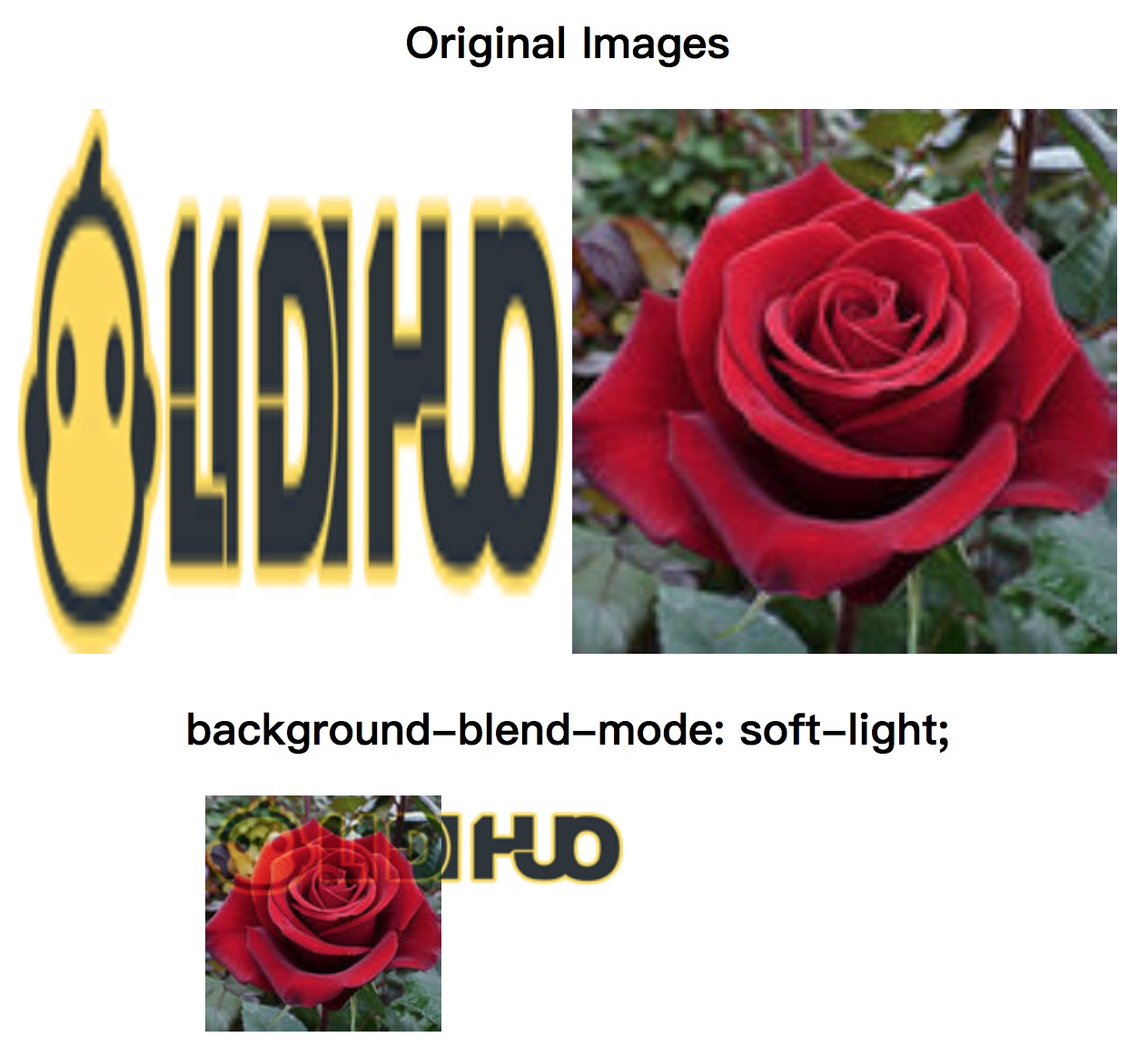
soft-light
用于将混合模式设置为柔光。
示例
<!DOCTYPE html>
<html>
<head>
<style>
#div1 img{
width: 300px;
height: 300px;
}
#example{
width: 400px;
height: 400px;
background-repeat: no-repeat;
background-image: url("../images/logo.png"), url("../uploads/html/rose.jpg");
background-blend-mode: soft-light;
}
</style>
</head>
<body>
<center>
<div id = "div1">
<h2> Original Images </h2>
<img src = "../images/logo.png">
<img src = "../uploads/html/rose.jpg">
</div>
<h2> background-blend-mode: soft-light; </h2>
<div id="example"></div>
</center>
</body>
</html>
输出
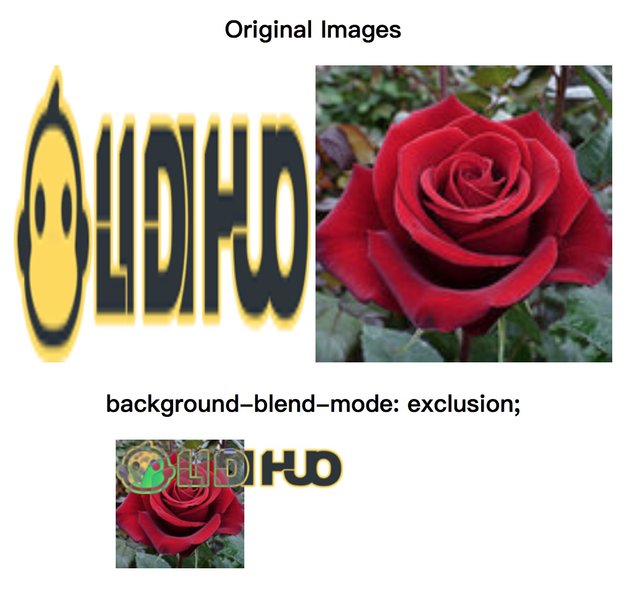
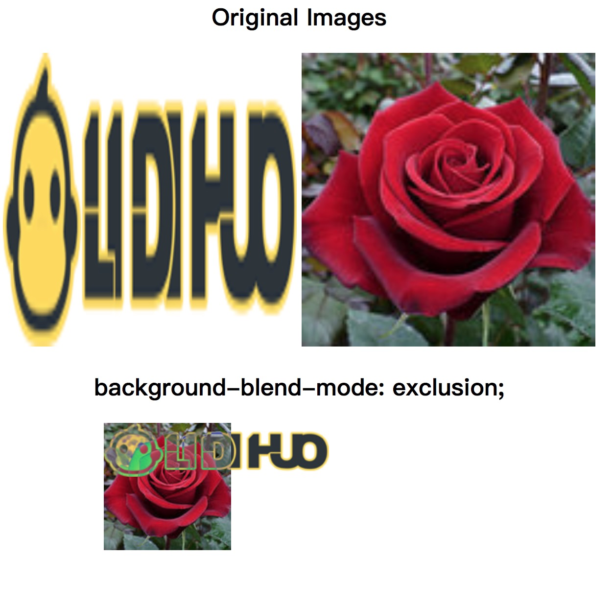
exclusion
用于将混合模式设置为排除。
示例
<!DOCTYPE html>
<html>
<head>
<style>
#div1 img{
width: 300px;
height: 300px;
}
#example{
width: 400px;
height: 400px;
background-repeat: no-repeat;
background-image: url("../images/logo.png"), url("../uploads/html/rose.jpg");
background-blend-mode: exclusion;
}
</style>
</head>
<body>
<center>
<div id = "div1">
<h2> Original Images </h2>
<img src = "../images/logo.png">
<img src = "../uploads/html/rose.jpg">
</div>
<h2> background-blend-mode: exclusion; </h2>
<div id="example"></div>
</center>
</body>
</html>
输出
hue
其结果是背景图像的
hue 与
发光度和
饱和度。
示例
<!DOCTYPE html>
<html>
<head>
<style>
#div1 img{
width: 300px;
height: 300px;
}
#example{
width: 400px;
height: 400px;
background-repeat: no-repeat;
background-image: url("../images/logo.png"), url("../uploads/html/rose.jpg");
background-blend-mode: hue;
}
</style>
</head>
<body>
<center>
<div id = "div1">
<h2> Original Images </h2>
<img src = "../images/logo.png">
<img src = "../uploads/html/rose.jpg">
</div>
<h2> background-blend-mode: hue; </h2>
<div id="example"></div>
</center>
</body>
</html>
输出
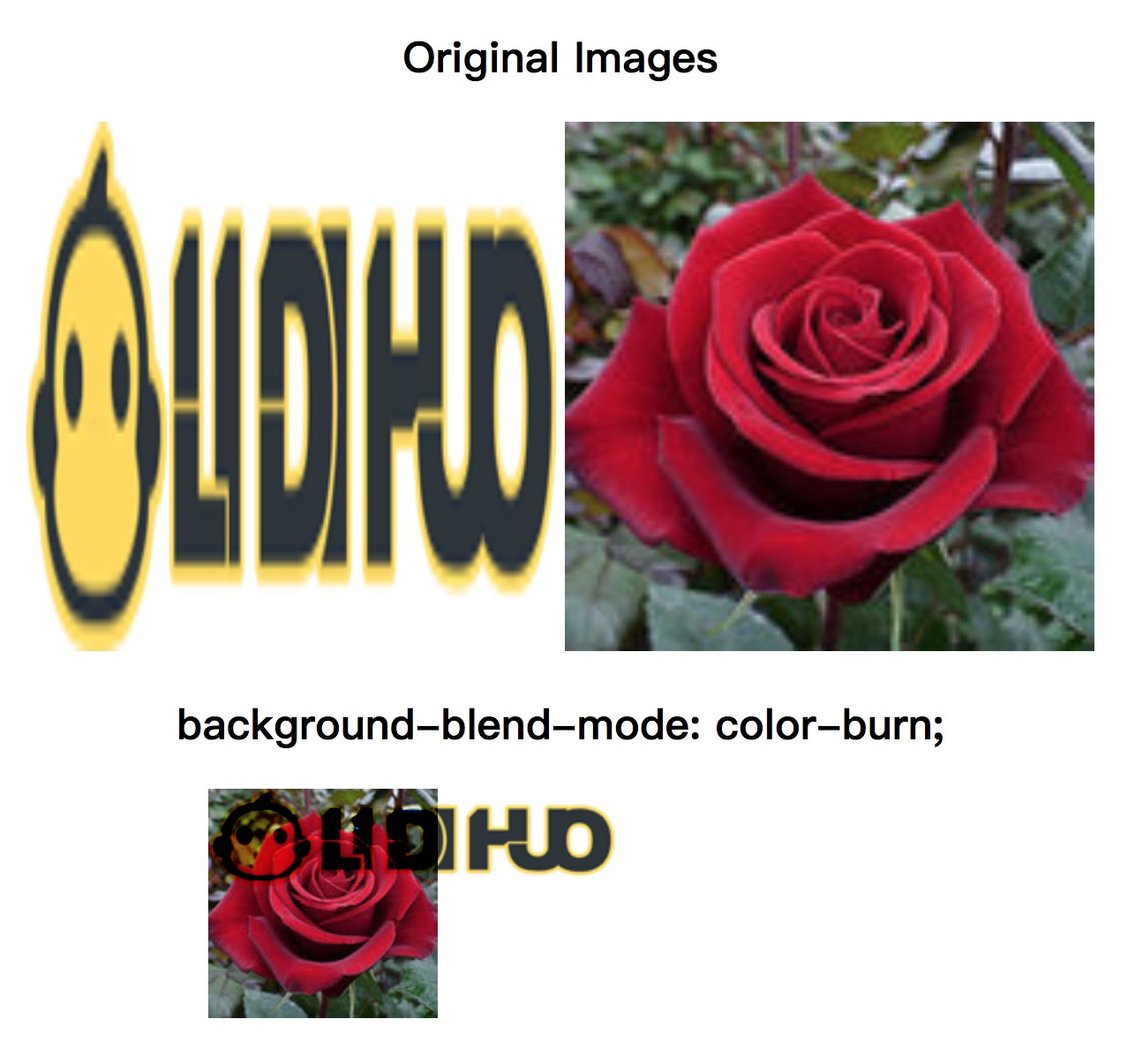
color-burn
用于将混合模式设置为颜色加深。
示例
<!DOCTYPE html>
<html>
<head>
<style>
#div1 img{
width: 300px;
height: 300px;
}
#example{
width: 400px;
height: 400px;
background-repeat: no-repeat;
background-image: url("../images/logo.png"), url("../uploads/html/rose.jpg");
background-blend-mode: color-burn;
}
</style>
</head>
<body>
<center>
<div id = "div1">
<h2> Original Images </h2>
<img src = "../images/logo.png">
<img src = "../uploads/html/rose.jpg">
</div>
<h2> background-blend-mode: color-burn; </h2>
<div id="example"></div>
</center>
</body>
</html>
输出
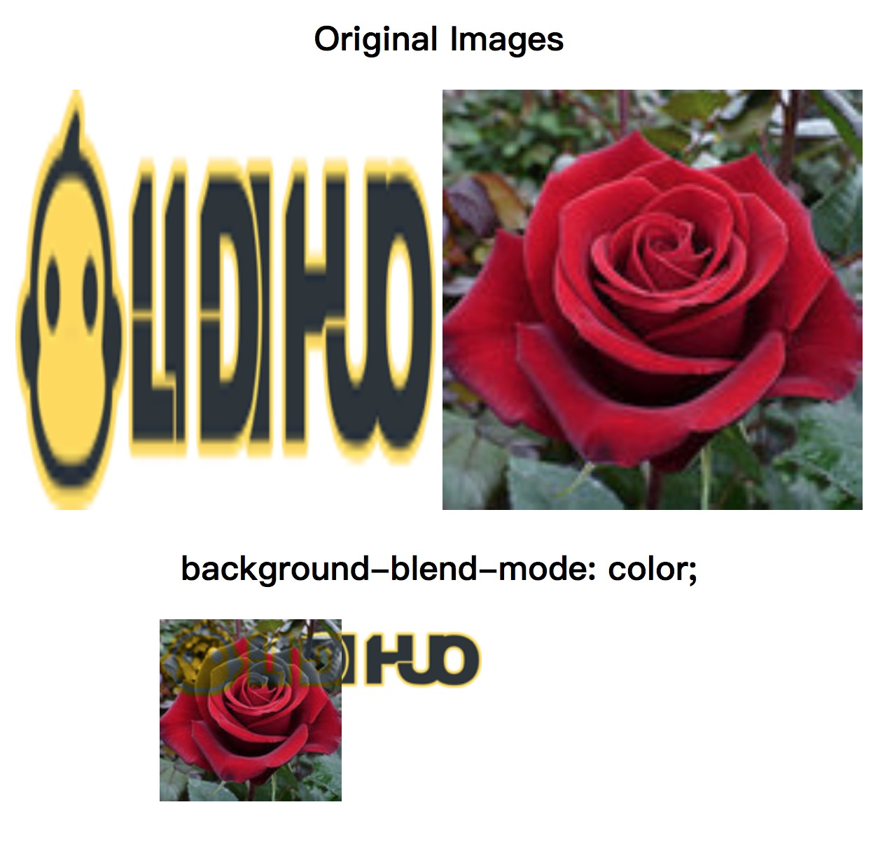
color
用于将混合模式设置为颜色。它保持背景色的
亮度和背景图像的
色调和
饱和度。
示例
<!DOCTYPE html>
<html>
<head>
<style>
#div1 img{
width: 300px;
height: 300px;
}
#example{
width: 400px;
height: 400px;
background-repeat: no-repeat;
background-image: url("../images/logo.png"), url("../uploads/html/rose.jpg");
background-blend-mode: color;
}
</style>
</head>
<body>
<center>
<div id = "div1">
<h2> Original Images </h2>
<img src = "../images/logo.png">
<img src = "../uploads/html/rose.jpg">
</div>
<h2> background-blend-mode: color; </h2>
<div id="example"></div>
</center>
</body>
</html>
输出

