CSS box-shadow
CSS box-shadow用于在元素框架周围添加类似阴影的效果。
语法
box-shadow: h-offset v-offset blur spread color |inset|inherit|initial|none;
让我们了解属性值。
h-offset:水平设置阴影位置。其正值会将阴影设置在框的右侧。其负值用于设置框左侧的阴影。
v-offset:与h-offset不同,它用于垂直设置阴影位置。其中的正值设置框下方的阴影,负值设置框上方的阴影。
blur:顾名思义,它用于模糊盒子阴影。此属性是可选的。
spread:设置阴影大小。点差大小取决于点差值。
color:顾名思义,此属性用于设置阴影的颜色。它是一个可选属性。
inset:通常,阴影在框的外部生成,但是通过使用插图,可以在框内创建阴影。
initial::用于将盒子阴影的属性设置为其默认值。
inherit:它是从其父继承。
none:这是默认值,不包含任何阴影属性。
让我们通过一些插图来理解它。
示例-简单阴影
<!DOCTYPE html>
<html>
<head>
<title>CSS box-shadow Property</title>
<style>
div
{
border: 1px solid;
padding: 10px;
}
#hvb
{
/* box-shadow: h-offset v-offset blur */
box-shadow: 5px 10px 10px;
}
#spr
{
/* box-shadow: h-offset v-offset blur spread */
box-shadow: 5px 10px 10px 10px;
}
#col
{
/* box-shadow: h-offset v-offset blur spread color */
box-shadow: 5px 10px 10px 10px orange;
}
#ins
{
/* box-shadow: h-offset v-offset blur spread color inset */
box-shadow: 5px 10px 10px 10px orange inset;
}
#init
{
/* box-shadow: initial */
box-shadow: initial;
}
#non
{
/* box-shadow: none */
box-shadow: none;
}
</style>
</head>
<body>
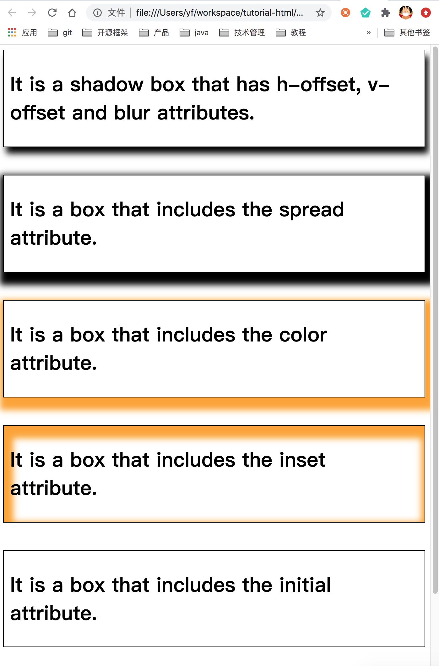
<div id = "hvb">
<h1>It is a shadow box that has h-offset, v-offset and blur attributes.</h1>
</div>
<br><br>
<div id = "spr">
<h1>It is a box that includes the spread attribute.</h1>
</div>
<br><br>
<div id = "col">
<h1>It is a box that includes the color attribute.</h1>
</div>
<br><br>
<div id = "ins">
<h1>It is a box that includes the inset attribute.</h1>
</div>
<br><br>
<div id = "init">
<h1>It is a box that includes the initial attribute.</h1>
</div>
<br><br>
<div id = "non">
<h1>It is a box that includes the default attribute i.e. none.</h1>
</div>
</body>
</html>
输出:

