CSS radio
单选按钮是HTML元素,可帮助从用户那里获取输入。尽管很难设置单选按钮的样式,但伪元素使设置单选按钮的样式更加容易。如果需要从一组项目中进行单个选择,则应用单选按钮。
此
HTML 元素通常在每个网站上都使用,但是在不设置样式的情况下,它们在每个网站上看起来都相似。因此,对它们进行样式设计会使我们的网站与众不同且更具吸引力。使用
CSS 设计单选按钮是一项有趣且富有创意的任务,它将为默认单选按钮提供新外观。
要创建自定义单选按钮,我们需要编写一个HTML标记,并且要编写样式,我们必须编写CSS。
通过使用一些方法,可以清除单选按钮的样式插图。让我们来看一些相同的插图。
示例
在此示例中,我们使用的是"
〜"同级组合器。它选择前一个选择器之后的所有元素。当用户将光标移到单选按钮上时,我们还使用伪类
:hover 设置样式。
<!DOCTYPE html>
<html>
<style>
.container {
display: block;
position: relative;
padding-left: 40px;
margin-bottom: 20px;
cursor: pointer;
font-size: 25px;
}
/* 隐藏默认单选按钮 */
.container input {
position: absolute;
opacity: 0;
cursor: pointer;
}
/* 自定义单选按钮 */
.check {
position: absolute;
top: 0;
left: 0;
height: 30px;
width: 30px;
background-color: lightgray;
border-radius: 50%;
}
.container:hover input ~ .check {
background-color: gray;
}
.container input:checked ~ .check {
background-color: blue;
}
.check:after {
content: "";
position: absolute;
display: none;
}
.container input:checked ~ .check:after {
display: block;
}
.container .check:after {
top: 8px;
left: 8px;
width: 15px;
height: 15px;
border-radius: 50%;
background: white;
}
</style>
<body>
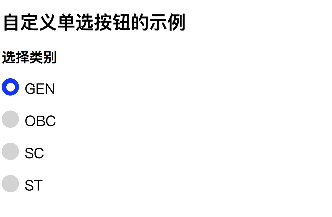
<h1> 自定义单选按钮的示例 </h1>
<h2> 选择类别 </h2>
<label class="container">GEN
<input type="radio" name="radio" checked>
<span class="check"></span>
</label>
<label class="container">OBC
<input type="radio" name="radio">
<span class="check"></span>
</label>
<label class="container">SC
<input type="radio" name="radio">
<span class="check"></span>
</label>
<label class="container">ST
<input type="radio" name="radio">
<span class="check"></span>
</label>
</body>
</html>
输出
为了更清楚地理解它,我们将看到另一个显示单选按钮样式的示例。使用CSS设置单选按钮的样式可以使网站看起来更加专业。
Example2
<!DOCTYPE html>
<html>
<head>
<style>
.container{
float: left;
margin: 10px;
}
.right{
float: left;
margin: 10px;
color: blue;
font-size: 20px;
font-weight:bold;
}
.radio {
width: 20px;
position: relative;
}
.radio label {
width: 20px;
height: 20px;
cursor: pointer;
position: absolute;
top: 0;
left: 0;
background: white;
border-radius: 50px;
box-shadow: inset 0px 1px 1px white, 3px 3px 9px rgba(0,0,0,0.5);
border: 1px solid black;
}
.radio label:after {
content: '';
position: absolute;
top: 4px;
left: 4px;
border: 6px solid blue;
border-radius: 50px;
opacity: 0;
}
.radio label:hover::after {
opacity: 0.3;
}
.radio input[type=radio] {
visibility: hidden;
}
.radio input[type=radio]:checked + label:after {
opacity: 1;
}
</style>
</head>
<body>
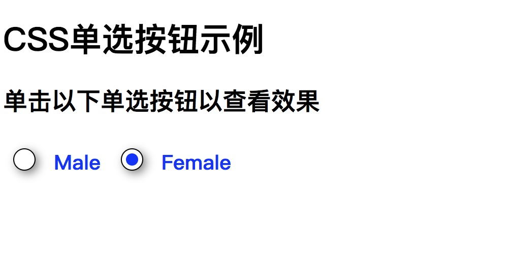
<h1> CSS单选按钮示例 </h1>
<h2> 单击以下单选按钮以查看效果 </h2>
<div class="container">
<div class="radio">
<input type="radio" value="Male" name='gender' id='male' />
<label for="male"></label>
</div>
</div>
<div class="right">Male</div>
<div class="container">
<div class="radio">
<input type="radio" value="Female" name='gender' id='female' />
<label for="female"></label>
</div>
</div>
<div class="right">Female</div>
</center>
</body>
</html>
输出

