CSS object-fit
此CSS属性指定如何调整视频或图像的大小以适合其内容框。它定义了元素如何以既定的宽度和高度适合容器。
通常应用于图像或视频。此属性指定元素对容器宽度和高度的反应。
语法
object-fit: fill | contain | cover | none | scale-down | initial | inherit;
object-fit值
此属性的主要五个值定义如下:
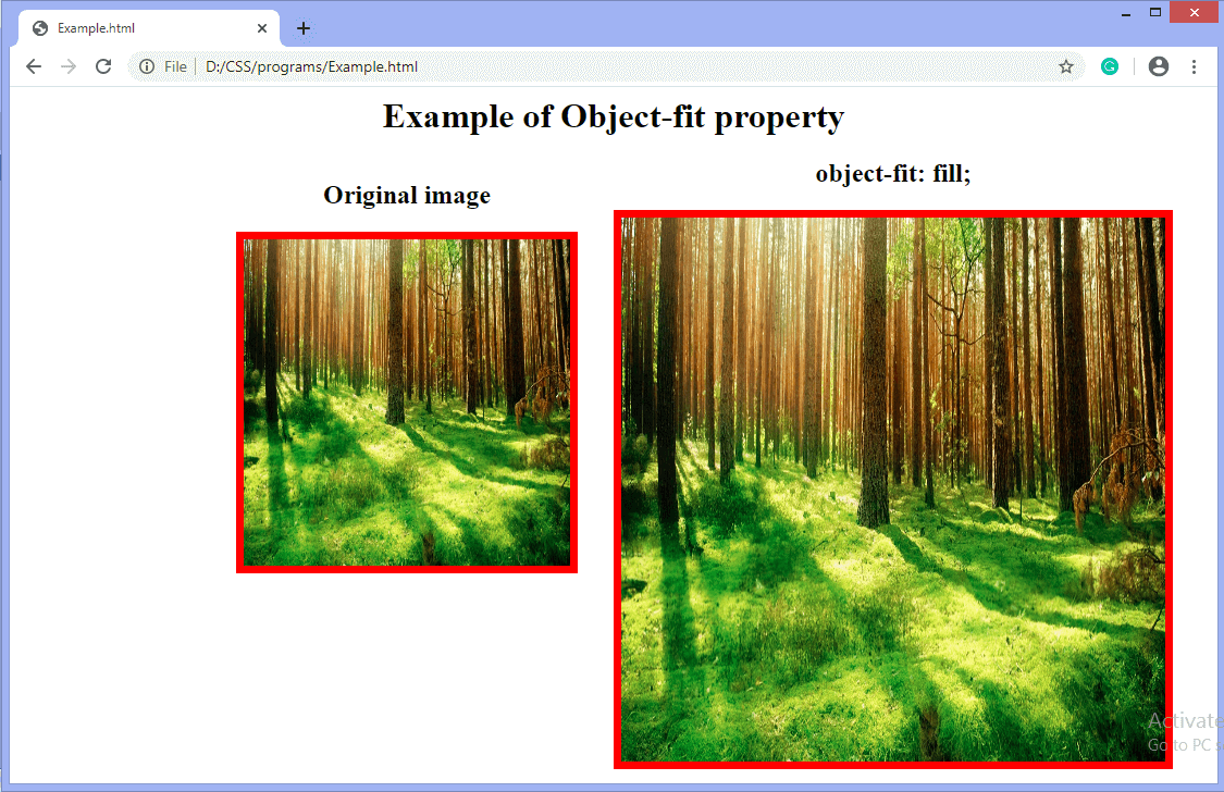
fill:是默认值。使用此值,整个对象将填充到容器中。替换内容的大小适合于填充内容框。如果对象的长宽比与框的长宽比不匹配,则对象将被挤压或拉伸以适合框。图像将填充该区域;
contain:它调整元素内容的大小以保留在容器内。它使图像适合盒子的宽度和高度,同时保持图像的纵横比。缩放缩放后的内容,以在保持元素的内容框内时保持宽高比。
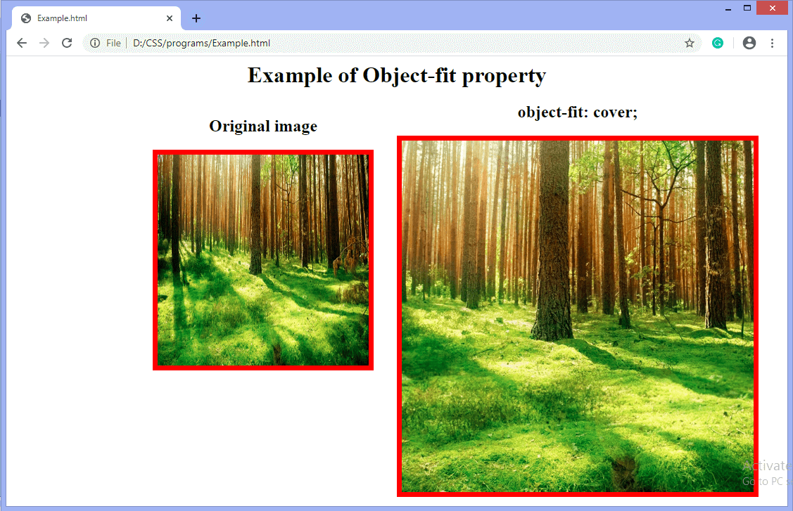
cover:它会调整元素的大小以覆盖其容器。它用图像填充整个框。如果对象的长宽比与框的长宽比不匹配,则会裁剪对象以适合对象。
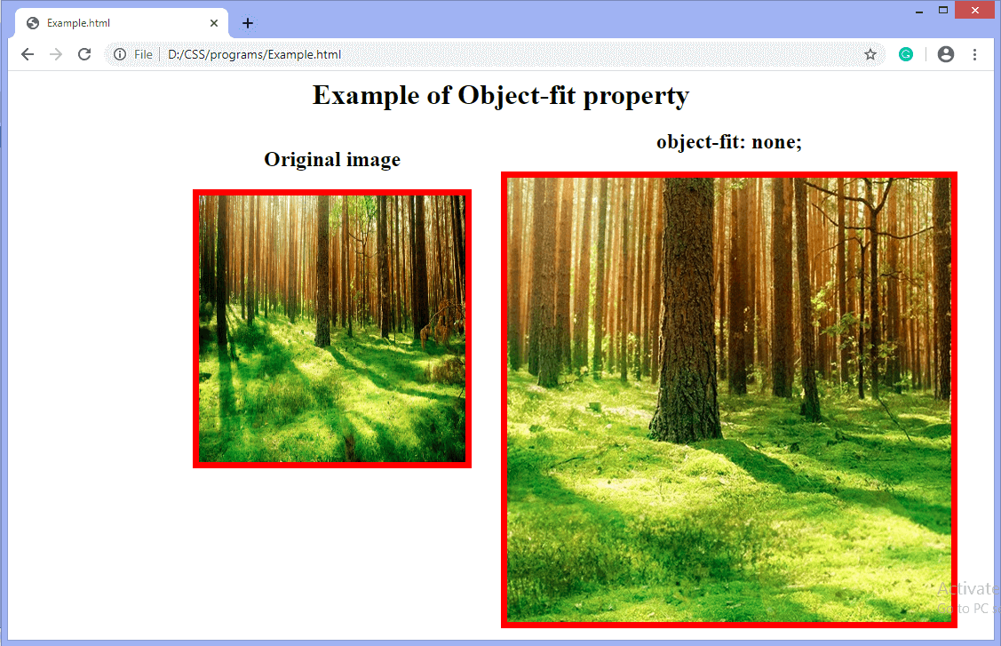
none:不会调整替换内容的大小。图像保留其原始大小,而忽略父级的高度和宽度。
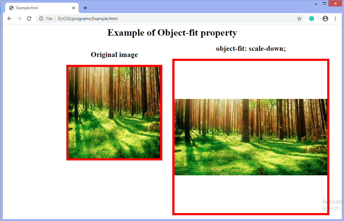
scale-down::将内容的大小设置为
none 或< strong>包含。它导致最小的对象尺寸。通过比较
无和
包含,找到最小的具体对象尺寸。
initial:将属性设置为其默认值,即图像被拉伸以适合容器,因为默认值为
fill 。
inherit:它从其继承值父元素。
现在,让我们通过每个示例来了解上述属性值。
示例:使用fill值
<html>
<head>
<style>
body {
text-align: center;
}
#img1 {
width: 300px;
height: 300px;
border: 7px solid red;
}
#obj {
width: 500px;
height: 500px;
object-fit: fill;
border: 7px solid red;
}
#left {
float: left;
text-align: center;
padding-left: 200px;
}
#center {
float: center;
text-align: center;
}
</style>
</head>
<body>
<h1> Example of Object-fit property </h1>
<div id="left">
<h2> Original image </h2>
<img id="img1" src="forest.jpg">
</div>
<div id="center">
<h2> object-fit: fill; </h2>
<img id="obj" src="forest.jpg" width="300" height="300" </div> </body> </html>
输出
示例-使用contain值
<html>
<head>
<style>
body {
text-align: center;
}
#img1 {
width: 300px;
height: 300px;
border: 7px solid red;
}
#obj {
width: 500px;
height: 500px;
object-fit: contain;
border: 7px solid red;
}
#left {
float: left;
text-align: center;
padding-left: 200px;
}
#center {
float: center;
text-align: center;
}
</style>
</head>
<body>
<h1> Example of Object-fit property </h1>
<div id="left">
<h2> Original image </h2>
<img id="img1" src="forest.jpg">
</div>
<div id="center">
<h2> object-fit: contain; </h2>
<img id="obj" src="forest.jpg" width="300" height="300" </div> </body> </html>
输出

示例-使用cover值
<html>
<head>
<style>
body {
text-align: center;
}
#img1 {
width: 300px;
height: 300px;
border: 7px solid red;
}
#obj {
width: 500px;
height: 500px;
object-fit: cover;
border: 7px solid red;
}
#left {
float: left;
text-align: center;
padding-left: 200px;
}
#center {
float: center;
text-align: center;
}
</style>
</head>
<body>
<h1> Example of Object-fit property </h1>
<div id="left">
<h2> Original image </h2>
<img id="img1" src="forest.jpg">
</div>
<div id="center">
<h2> object-fit: cover; </h2>
<img id="obj" src="forest.jpg" width="300" height="300" </div> </body> </html>
输出
示例-使用none值
<html>
<head>
<style>
body {
text-align: center;
}
#img1 {
width: 300px;
height: 300px;
border: 7px solid red;
}
#obj {
width: 500px;
height: 500px;
object-fit: none;
border: 7px solid red;
}
#left {
float: left;
text-align: center;
padding-left: 200px;
}
#center {
float: center;
text-align: center;
}
</style>
</head>
<body>
<h1> Example of Object-fit property </h1>
<div id="left">
<h2> Original image </h2>
<img id="img1" src="forest.jpg">
</div>
<div id="center">
<h2> object-fit: none; </h2>
<img id="obj" src="forest.jpg" width="300" height="300" </div> </body> </html>
输出
示例-使用scale-down值
<html>
<head>
<style>
body {
text-align: center;
}
#img1 {
width: 300px;
height: 300px;
border: 7px solid red;
}
#obj {
width: 500px;
height: 500px;
object-fit: scale-down;
border: 7px solid red;
}
#left {
float: left;
text-align: center;
padding-left: 200px;
}
#center {
float: center;
text-align: center;
}
</style>
</head>
<body>
<h1> Example of Object-fit property </h1>
<div id="left">
<h2> Original image </h2>
<img id="img1" src="forest.jpg">
</div>
<div id="center">
<h2> object-fit: scale-down; </h2>
<img id="obj" src="forest.jpg" width="300" height="300" </div> </body> </html>
输出

