CSS border-image
此CSS属性定义了用作元素边框的图像。它在元素外部绘制图像,并用相应的图像替换元素的边框。用图像替换元素的边框是一项有趣的任务。
border-image 属性可以应用于除内部表的元素(例如,内部元素)之外的所有元素。当
border-collapse设置为
collapse。
这是
border-image-source,border-image-slice,border-image-width,border-image-outset 和
border-image-repeat 的简写属性。我们可以使用
border-image 属性立即设置所有这些属性。如果未指定任何值,则将它们设置为其默认值。此属性的默认值如下:
border-image: none 100% 1 0 stretch
语法
border-image: source slice width outset repeat | initial | inherit;
此属性的值列表如下。
| 值 |
说明 |
| border-image-source: |
它指定边框图像的来源。它设置图像的路径,或者可以说它指定了要用作边框的图像的位置。 |
| border-image-slice: |
它用于对图像进行分割或切片,该图像由 border-image-source 属性指定。此属性的值指定如何对图像进行切片以创建边框。此属性将图像分为九个部分:
四个角落 四条边, 一个中心 可以接受四个无单位的正值。其默认值为 100%。 |
| border-image-width: |
它设置边框图像的宽度。它可以接受无单位的正值,百分比值或关键字auto。其默认值为 1 。我们最多可以指定四个值来提供各个边的宽度。 |
| border-image-outset: |
它设置了从边框框中显示边框图像的空间量。 |
| border-image-repeat: |
它控制图像的重复以填充边框区域。我们最多可以为此属性指定两个值。如果我们指定一个值,那么它将同时应用于垂直和水平方向。但是,如果我们指定两个值,则第一个值应用于水平边,第二个值应用于垂直边。
此属性的值在下面列出。
stretch repeat round space 此属性的默认值为 stretch 。 |
| Initial |
它将属性设置为其默认值(边框图像:无100%1 0 Stretch)。 |
| inherit |
它从其父元素继承属性。 |
现在,让我们看一些示例,以了解如何使用
border-image 属性设置边框图像。
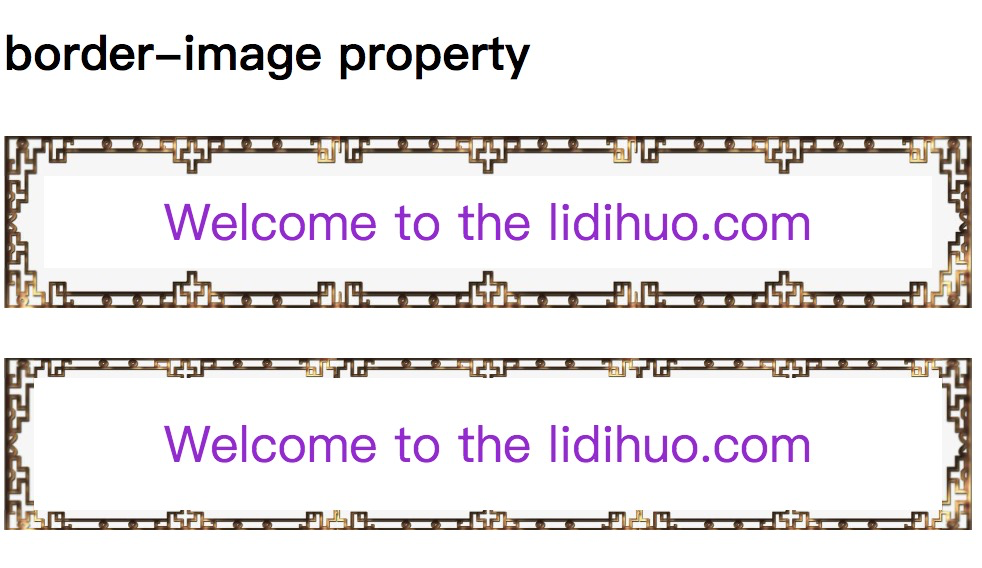
示例
在此示例中,我们将段落元素的边框替换为图像。在第一段中,我们指定
border-image-repeat 属性的单个值(即
round ),而在第二段中,我们指定两个值(
圆,拉伸),第一个值为水平边,第二个值为垂直边。
<!DOCTYPE html>
<html>
<head>
<title>
CSS border-image Property
</title>
<style>
p {
border: 10px solid transparent;
padding: 15px;
text-align: center;
font-size: 25px;
color: darkviolet;
}
#border {
border-image: url('border.png') 60 / 20px 20px round;
}
#border1 {
border-image: url('diamond.png') 43 / 10px 15px round stretch;
}
</style>
</head>
<body>
<h2>border-image property</h2>
<p id="border">
Welcome to the lidihuo.com
</p>
<p id="border1">
Welcome to the lidihuo.com
</p>
</body>
</html>
输出
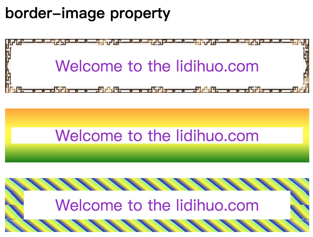
我们还可以将渐变指定为边界图像。
示例-使用线性渐变
在此示例中,我们使用
线性渐变和
重复线性渐变作为段落元素的边框图像。
<!DOCTYPE html>
<html>
<head>
<title>
CSS border-image Property
</title>
<style>
p {
border: 10px solid transparent;
padding: 15px;
text-align: center;
font-size: 25px;
color: darkviolet;
}
#border {
border-image: url('../uploads/html/border.jpg') 40 round stretch;
}
#border1 {
border-image: linear-gradient(orange, yellow, green) 40 / 30px 10px stretch;
}
#border2 {
border-image: repeating-linear-gradient(50deg, blue, yellow, lightgreen 20px) 30 / 20px 30px round;
}
</style>
</head>
<body>
<h2>border-image property</h2>
<p id="border">
Welcome to the lidihuo.com
</p>
<p id="border1">
Welcome to the lidihuo.com
</p>
<p id="border2">
Welcome to the lidihuo.com
</p>
</body>
</html>
输出
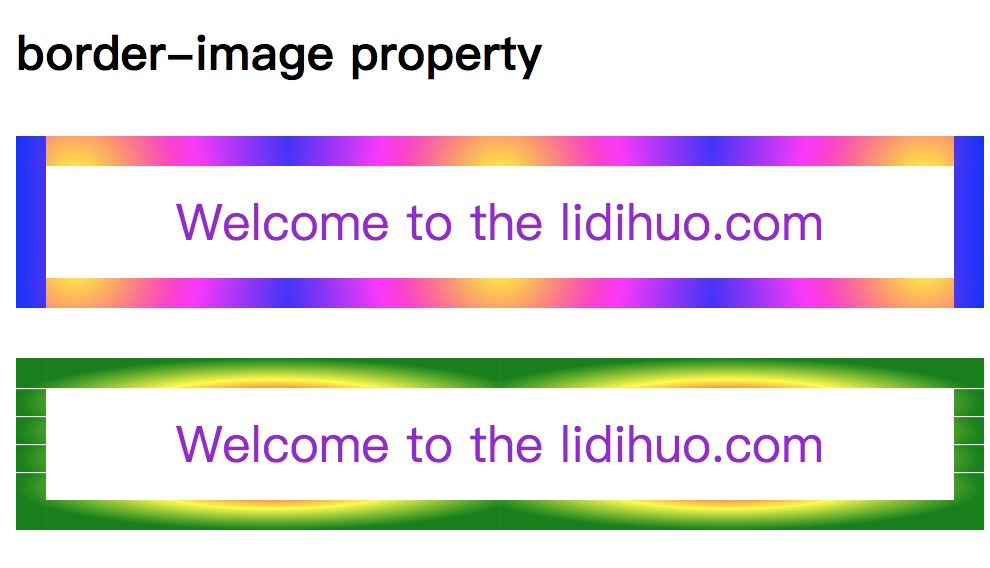
示例-使用径向渐变
在此示例中,我们使用
radial-gradient 作为段落元素的边框图像。
<!DOCTYPE html>
<html>
<head>
<title>
CSS border-image Property
</title>
<style>
p{
border: 10px solid transparent;
padding: 15px;
text-align:center;
font-size: 25px;
color: darkviolet;
}
#border1 {
border-image: radial-gradient(circle, yellow, magenta, blue) 30 / 15px repeat;
}
#border2 {
border-image: radial-gradient(farthest-side, red, yellow, green) 30 / 15px round;
}
</style>
</head>
<body>
<h2>border-image property</h2>
<p id = "border1">
Welcome to the lidihuo.com
</p>
<p id = "border2">
Welcome to the lidihuo.com
</p>
</body>
</html>
输出

