CSS checkbox
Checkbox是一个HTML元素,用于接收用户的输入。复选框的样式很难设置,但是使用伪元素可以更轻松地设置复选框的样式。
每个网站中如果不设置checkbox样式,则它们看起来都很相似。对它们进行样式设计会让网站与众不同且更具吸引力。
通过使用一些插图可以清楚地显示复选框的样式。让我们来看一些相同的插图。
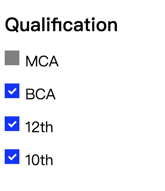
示例1
下面示例中,我们使用的是
〜同级组合器。它选择前一个选择器之后的所有元素。当用户将光标移到复选框上方时,我们还使用伪类
:hover 设置了复选框的样式。
<!DOCTYPE html>
<html>
<style>
.container {
display: block;
position: relative;
padding-left: 35px;
margin-bottom: 20px;
cursor: pointer;
font-size: 25px;
}
/* 隐藏默认复选框 */
.container input {
visibility: hidden;
cursor: pointer;
}
/* 创建一个自定义复选框 */
.mark {
position: absolute;
top: 0;
left: 0;
height: 25px;
width: 25px;
background-color: lightgray;
}
.container:hover input ~ .mark {
background-color: gray;
}
.container input:checked ~ .mark {
background-color: blue;
}
/* 创建标记/指示符(未选中时隐藏) */
.mark:after {
content: "";
position: absolute;
display: none;
}
/* 选中时显示标记*/
.container input:checked ~ .mark:after {
display: block;
}
/* 标记/指示器的样式 */
.container .mark:after {
left: 9px;
top: 5px;
width: 5px;
height: 10px;
border: solid white;
border-width: 0 3px 3px 0;
transform: rotate(45deg);
}
</style>
<body>
<h1>Qualification</h1>
<label class="container">MCA
<input type="checkbox">
<span class="mark"></span>
</label>
<label class="container">BCA
<input type="checkbox">
<span class="mark"></span>
</label>
<label class="container">12th
<input type="checkbox">
<span class="mark"></span>
</label>
<label class="container">10th
<input type="checkbox" checked="check">
<span class="mark"></span>
</label>
</body>
</html>
输出:
示例2
在此示例中,我们将看到修改后的选中标记。
<!DOCTYPE html>
<html>
<head>
<style>
.container {
display: block;
position: relative;
padding-left: 45px;
margin-bottom: 15px;
cursor: pointer;
font-size: 20px;
}
/* 隐藏原始复选框 */
input[type=checkbox] {
visibility: hidden;
}
/* 创建自定义复选框*/
.mark {
position: absolute;
top: 0;
left: 0;
height: 25px;
width: 25px;
background-color: lightgray;
}
/*将鼠标悬停在复选框上时将显示背景色 */
.container:hover input ~ .mark {
background-color: gray;
}
/*选中复选框时显示的背景色 */
.container input:checked ~ .mark {
background-color: blue;
}
/* 要在复选框中显示的选中标记 */
/* 未选中时不会显示 */
.mark:after {
content: "";
position: absolute;
display: none;
}
/* 选中时显示选中标记 */
.container input:checked ~ .mark:after {
display: block;
}
/* 创建一个正方形作为复选标记*/
.container .mark:after {
left: 6px;
bottom: 6px;
width: 6px;
height: 6px;
border: solid white;
border-width: 4px 4px 4px 4px;
}
</style>
</head>
<body>
<h1>Qualification</h1>
<label class="container">
MCA
<input type="checkbox">
<span class="mark"></span>
</label>
<label class="container">
BCA
<input type="checkbox">
<span class="mark"></span>
</label>
<label class="container">
12th
<input type="checkbox">
<span class="mark"></span>
</label>
<label class="container">
10th
<input type="checkbox" checked="check">
<span class="mark"></span>
</label>
</body>
</html>
输出:

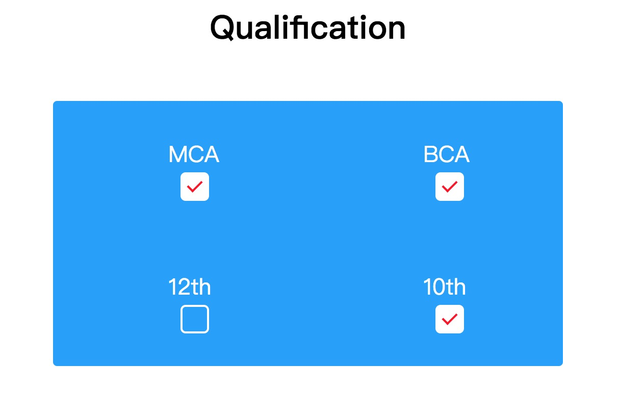
示例3
现在,我们将看到另一个样式复选框的示例。在此示例中,我们将看到涟漪效应,这使复选框更具吸引力。此效果使复选框具有新外观。与上面的示例相似,我们还使用了"
〜"同级组合器,它将选择前一个选择器之后的所有元素。还使用了一些伪类,例如
:checked、:before、:after,等。
请参见以下示例,通过使用以下方法在复选框中创建波纹效果CSS。
<html>
<head>
<style>
body{
text-align: center;
}
.check {
width: 500px;
margin: 50px auto;
clear: both;
display: block;
background-color: #009BFF;
border-radius: 4px;
}
.check::after {
clear: both;
display: block;
content: "";
}
.check .checkbox-container {
float: left;
width: 50%;
box-sizing: border-box;
text-align:center;
padding: 40px 0px;
}
/* 样式复选框开始 */
.checkbox-label {
color: white;
display: block;
position: relative;
margin: auto;
cursor: pointer;
font-size: 22px;
line-height: 24px;
height: 50px;
width: 24px;
clear: both;
}
.checkbox-label input {
position: absolute;
opacity: 0;
cursor: pointer;
}
.checkbox-label .mark {
top:30px;
position: absolute;
height: 24px;
width: 24px;
background-color: transparent;
border-radius: 5px;
transition: all 0.3s ease-in;
border: 2px solid white;
}
.checkbox-label input:checked ~ .mark {
background-color: white;
border-radius: 5px;
transform: rotate(0deg) scale(1);
opacity:1;
border: 2px solid white;
}
.checkbox-label .mark::after {
position: absolute;
content: "";
border-radius: 5px;
}
.checkbox-label input:checked ~ .mark::after {
transform: rotate(45deg) scale(1);
left: 8px;
top: 3px;
width: 6px;
height: 12px;
border: solid red;
border-width: 0 2px 2px 0;
border-radius: 0;
}
/* 纹波效果 */
.checkbox-label .mark::before {
position: absolute;
content: "";
border-radius: 10px;
border: 5px solid yellow;
transform: scale(0);
}
.checkbox-label input:checked ~ .mark::before {
left: -3px;
top: -3px;
width: 24px;
height: 24px;
border-radius: 5px;
transform: scale(3);
opacity:0;
transition: all 0.3s ease-out;
}
</style>
</head>
<body>
<h1>Qualification</h1>
<div class="check">
<div class="checkbox-container">
<label class="checkbox-label">MCA
<input type="checkbox">
<span class="mark"></span>
</label>
</div>
<div class="checkbox-container">
<label class="checkbox-label">BCA
<input type="checkbox">
<span class="mark"></span>
</label>
</div>
<div class="checkbox-container">
<label class="checkbox-label">12th
<input type="checkbox">
<span class="mark"></span>
</label>
</div>
<div class="checkbox-container">
<label class="checkbox-label">10th
<input type="checkbox" checked="check">
<span class="mark"></span>
</label>
</div>
</div>
</body>
</html>
输出:

