CSS clip-path
CSS clip-path属性用于创建剪切区域,并指定元素的可见区域。区域内部的区域将可见,而外部区域则被隐藏。裁剪之外的所有内容都将被浏览器裁剪,包括边框,
文本阴影,以及更多。
它使我们可以定义要显示的元素的特定区域,而不是显示整个区域。通过使用椭圆,圆形,多边形或inset关键字,可以更轻松地裁剪基本形状。
语法
clip-path: <clip-source> | [ <basic-shape> || <geometry-box> || none
clip-source
basic-shape
geometry-box
none
让我们讨论以上属性值。
clip-source:这是一个指向SVG的URL,
<clippath> 元素。
basic-shape:它将元素剪切为基本形状。它具有四个基本形状:圆形,椭圆形,多边形和插图。
它是一种形状,其中
<geometry-box> 的值定义位置和大小。如果没有定义几何框,则边框将用作参考框。
geometry-box:
<geometry-box> 定义基本形状的参考框。如果由
<basic-shape> 的组合定义,则它将用作
<basic-shape> 进行剪切的参考框。
它可以具有以下值:
margin-box:可用作参考框,可以将其定义为由外部边缘指定的形状,并包括该形状的角半径。
border-box:可用作参考框,它是由外部边界边缘定义的值。
padding-box:可用作参考框,它指定由
content-box:可用作参考框。
fill-box:对象边界框可用作参考框。
stroke-box:笔划边界框可用作参考框。
view-box:它使用最接近的SVG视口作为参考框。
使用剪切路径定义基本形状
如上所述,有四个基本形状。让我们用每个示例了解它们。
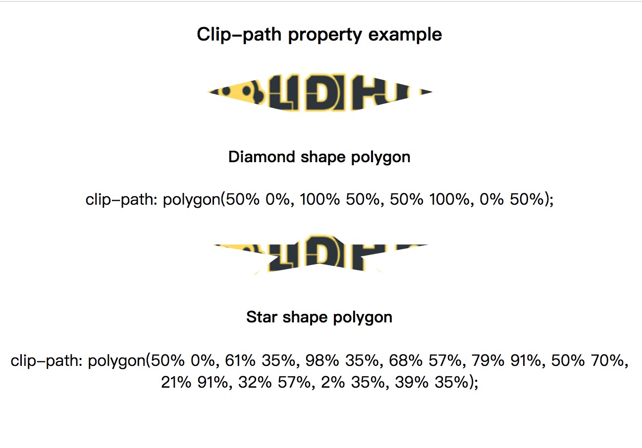
多边形
它是可用的基本形状中的一种。它允许我们定义任意数量的点。给定的点位于任何单位(例如基于百分比或基于像素的)的
X 和
Y 坐标对中。
我们可以理解通过使用以下示例此基本形状。在下面的示例中,我们定义了两个多边形:菱形和星形。
示例
<!DOCTYPE html>
<html>
<head>
</head>
<style>
.example {
clip-path: polygon(50% 0%, 100% 50%, 50% 100%, 0% 50%);
}
.example1 {
clip-path: polygon(50% 0%, 61% 35%, 98% 35%, 68% 57%, 79% 91%, 50% 70%, 21% 91%, 32% 57%, 2% 35%, 39% 35%);
}
</style>
<body>
<center>
<h3> Clip-path property example </h3>
<img src="../images/logo.png" class="example">
<h4>Diamond shape polygon</h4>
<p>clip-path: polygon(50% 0%, 100% 50%, 50% 100%, 0% 50%);</p>
<img src="../images/logo.png" class="example1">
<h4>Star shape polygon</h4>
<p>clip-path: polygon(50% 0%, 61% 35%, 98% 35%, 68% 57%, 79% 91%, 50% 70%, 21% 91%, 32% 57%, 2% 35%, 39% 35%);</p>
</center>
</body>
</html>
输出
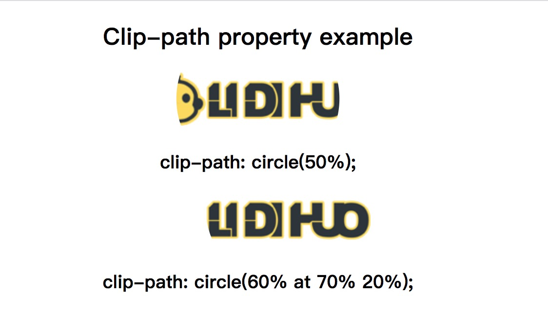
圆
定义圆的默认语法为
圆(posX posY处的半径)。该位置是可选的,其默认值为
50%50%。
示例
<!DOCTYPE html>
<html>
<head>
</head>
<style>
.example {
clip-path: circle(50%);
}
.example1 {
clip-path: circle(60% at 70% 20%);
}
</style>
<body>
<center>
<h2> Clip-path property example </h2>
<img src="../images/logo.png" class="example">
<h3>clip-path: circle(50%);</h3>
<img src="../images/logo.png" class="example1">
<h3>clip-path: circle(60% at 70% 20%);</h3>
</center>
</body>
</html>
输出
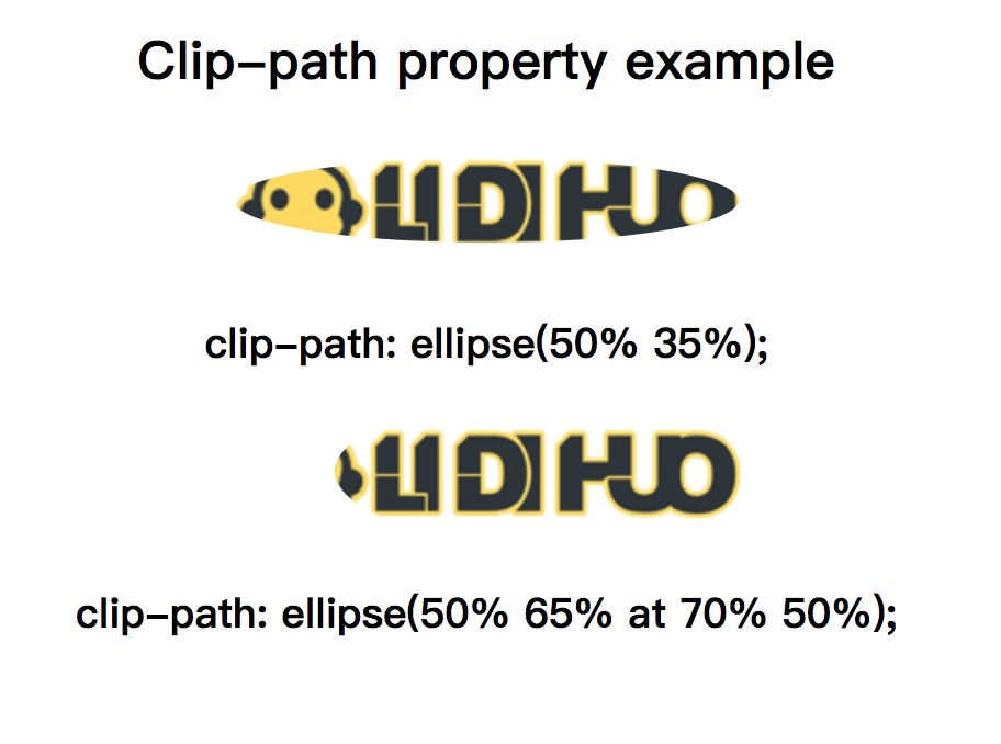
椭圆
定义椭圆的语法为:
椭圆(posX posY处的radiusX radiusY)。像圆圈一样,它的位置也是可选的,默认为50%50%。
示例
<!DOCTYPE html>
<html>
<head>
</head>
<style>
.example {
clip-path: ellipse(50% 35%);
}
.example1 {
clip-path: ellipse(50% 65% at 70% 50%);
}
</style>
<body>
<center>
<h2> Clip-path property example </h2>
<img src="../images/logo.png" class="example">
<h3> clip-path: ellipse(50% 35%);</h3>
<img src="../images/logo.png" class="example1">
<h3> clip-path: ellipse(50% 65% at 70% 50%);</h3>
</center>
</body>
</html>
输出
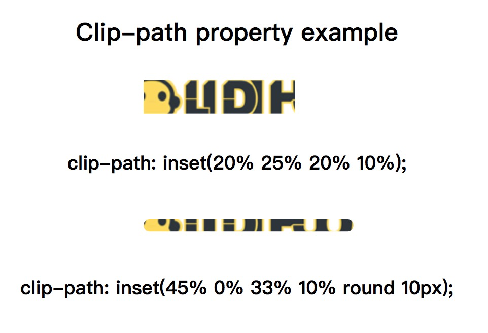
插入
使用插入,我们可以定义一个内部矩形,而外部的任何东西都将被丢弃。
示例
<!DOCTYPE html>
<html>
<head>
</head>
<style>
.example {
clip-path: inset(20% 25% 20% 10%);
}
.example1 {
clip-path: inset(45% 0% 33% 10% round 10px);
}
</style>
<body>
<center>
<h2> Clip-path property example </h2>
<img src="../images/logo.png" class="example">
<h3>clip-path: inset(20% 25% 20% 10%);</h3>
<img src="../images/logo.png" class="example1">
<h3>clip-path: inset(45% 0% 33% 10% round 10px);</h3>
</center>
</body>
</html>
输出
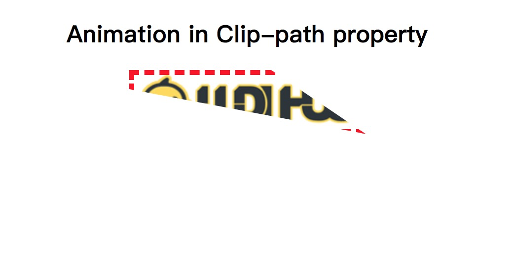
添加动画
我们还可以将动画应用于此属性。动画和转场将通过此CSS属性创建有趣的效果。
让我们看一下相同的插图。
示例
<!DOCTYPE html>
<html>
<head>
</head>
<style>
img.example {
animation: anime 4s infinite;
border: 5px dashed red;
}
@keyframes anime {
0% {
clip-path: polygon(0 0, 100% 0, 100% 80%, 0% 70%);
}
20% {
clip-path: polygon(40% 0, 50% 0, 100% 100%, 0% 80%);
}
40% {
clip-path: polygon(0 0, 60% 72%, 100% 100%, 0 35%);
}
60% {
clip-path: polygon(70% 0, 20% 0, 100% 100%, 0% 80%);
}
80% {
clip-path: polygon(0 70%, 60% 0, 100% 32%, 0 40%);
}
100% {
clip-path: polygon(0 0, 60% 0, 100% 100%, 0% 30%);
}
}
</style>
<body>
<center>
<h2> Animation in Clip-path property </h2>
<img src="../images/logo.png" class="example">
</center>
</body>
</html>
输出

