CSS 导航
GUI下有一个导航栏或导航系统,可帮助访问者访问信息。它是网页上的UI元素,其中包含网站其他部分的链接。
导航栏通常以水平链接列表的形式显示在页面顶部。可以将其放置在徽标或标题的下方,但应始终将其放置在网页的主要内容之前。
使用易于使用的导航对于网站很重要。它在网站中起着重要作用,因为它允许访问者快速访问任何部分。
让我们详细讨论水平导航栏和垂直导航栏。
水平导航栏
水平导航栏是水平链接列表,通常位于页面顶部。
让我们看看如何使用创建水平导航栏。
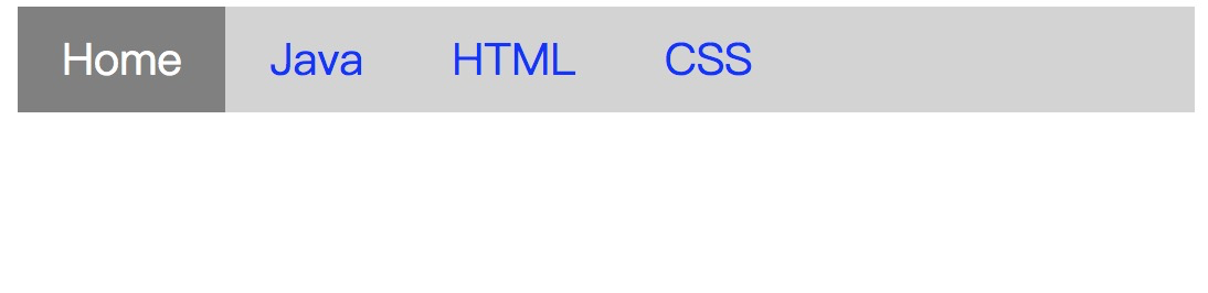
示例
在此示例中,我们添加了
overflow:hidden 属性,以防止
li 元素进入列表之外,而
display:block 属性将链接显示为block元素,并使整个链接区域可单击。
我们还添加了
float:left 属性,该属性使用float来使块元素彼此相邻滑动。
如果要使用全角背景色,则必须将
background-color属性添加<ul>而不是
<a> 元素。
<!DOCTYPE html>
<html>
<head>
<style>
ul {
list-style-type: none;
margin: 0;
padding: 0px;
overflow: hidden;
background-color: lightgray;
}
li {
float: left;
}
li a {
display: block;
color: blue;
font-size:20px;
text-align: center;
padding: 10px 20px;
text-decoration: none;
}
.active{
background-color: gray;
color: white;
}
li a:hover {
background-color: orange;
color: white;
}
</style>
</head>
<body>
<ul>
<li><a class="active" href="#home">Home</a></li>
<li><a href="#">Java</a></li>
<li><a href="#">HTML</a></li>
<li><a href="#">CSS</a></li>
</ul>
</body>
</html>
输出:
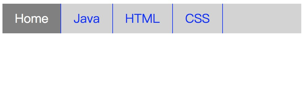
边界分隔线
我们可以使用
border-right 属性在导航栏中的链接之间添加边框。以下示例对其进行了更清晰的说明。
示例
<!DOCTYPE html>
<html>
<head>
<style>
ul {
list-style-type: none;
margin: 0;
padding: 0px;
overflow: hidden;
background-color: lightgray;
}
li {
float: left;
border-right: 1px solid blue;
}
li a {
display: block;
color: blue;
font-size:20px;
text-align: center;
padding: 10px 20px;
text-decoration: none;
}
.active{
background-color: gray;
color: white;
}
li a:hover {
background-color: orange;
color: white;
}
</style>
</head>
<body>
<ul>
<li><a class="active" href="#home">Home</a></li>
<li><a href="#">Java</a></li>
<li><a href="#">HTML</a></li>
<li><a href="#">CSS</a></li>
</ul>
</body>
</html>
输出:
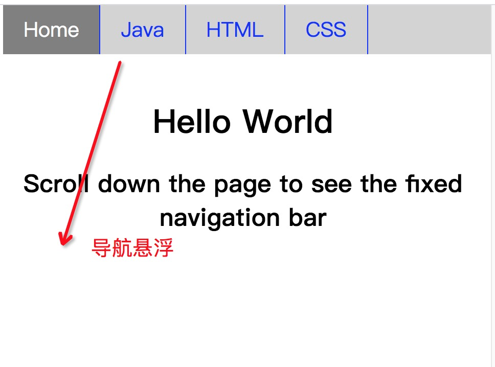
固定的导航栏
滚动页面时,固定的导航栏位于页面的底部或顶部。参见相同的示例。
示例
<!DOCTYPE html>
<html>
<head>
<style>
ul {
list-style-type: none;
position: fixed;
width:100%;
top:0;
margin: 0;
padding: 0px;
overflow: hidden;
background-color: lightgray;
}
li {
float: left;
border-right: 1px solid blue;
}
li a {
display: block;
color: blue;
font-size:20px;
text-align: center;
padding: 10px 20px;
text-decoration: none;
}
.active{
background-color: gray;
color: white;
}
li a:hover {
background-color: orange;
color: white;
}
</style>
</head>
<body>
<ul>
<li><a class="active" href="#home">Home</a></li>
<li><a href="#">Java</a></li>
<li><a href="#">HTML</a></li>
<li><a href="#">CSS</a></li>
</ul>
<h1 style="padding-top: 100px; text-align: center;">Hello World</h1>
<h2 style="padding-bottom: 2000px; text-align: center;">Scroll down the page to see the fixed navigation bar</h2>
</body>
</html>
输出:
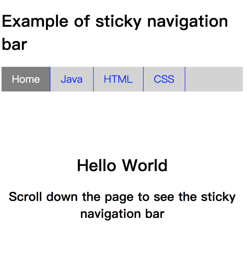
粘性导航
position:sticky; 属性用于根据用户的滚动位置来定位元素。
此CSS属性允许元素在滚动到达特定点时停留。根据滚动位置,粘性元素可在
固定和
相对属性
之间切换。
例子
<!DOCTYPE html>
<html>
<head>
<style>
ul {
list-style-type: none;
position: sticky;
width:100%;
top:0;
margin: 0;
padding: 0px;
overflow: hidden;
background-color: lightgray;
}
li {
float: left;
border-right: 1px solid blue;
}
li a {
display: block;
color: blue;
font-size:20px;
text-align: center;
padding: 10px 20px;
text-decoration: none;
}
.active{
background-color: gray;
color: white;
}
li a:hover {
background-color: orange;
color: white;
}
</style>
</head>
<body>
<h1> Example of sticky navigation bar</h1>
<ul>
<li><a class="active" href="#home">Home</a></li>
<li><a href="#">Java</a></li>
<li><a href="#">HTML</a></li>
<li><a href="#">CSS</a></li>
</ul>
<h1 style="padding-top: 100px; text-align: center;">Hello World</h1>
<h2 style="padding-bottom: 2000px; text-align: center;">Scroll down the page to see the sticky navigation bar</h2>
</body>
</html>
输出:
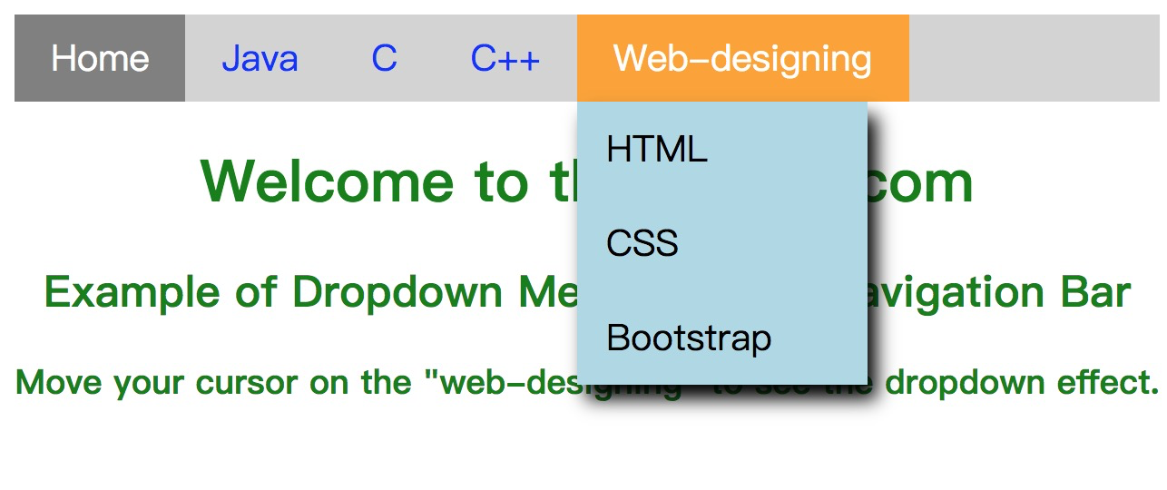
下拉导航栏
下面的示例说明如何在导航栏中创建下拉菜单。
示例
<!DOCTYPE html>
<html>
<head>
<style>
ul {
list-style-type: none;
margin: 0;
padding: 0;
overflow: hidden;
background-color: lightgray;
}
li {
float: left;
}
li a, .dropbtn {
display: inline-block;
color: blue;
font-size:20px;
text-align: center;
padding: 10px 20px;
text-decoration: none;
}
.active{
background-color: gray;
color: white;
}
li a:hover , .dropdown:hover .dropbtn{
background-color: orange;
color: white;
}
.dropdown-content {
display: none;
position: absolute;
background-color: lightblue;
min-width: 160px;
box-shadow: 5px 8px 10px 0px black;
}
.dropdown-content a {
color: black;
padding: 12px 16px;
text-decoration: none;
display: block;
text-align: left;
}
.dropdown-content a:hover {
background-color: gray;
color:white;
}
.dropdown:hover .dropdown-content {
display: block;
}
h1,h2,h3{
text-align:center;
color: green;
}
</style>
</head>
<body>
<ul>
<li><a class="active" href="#home">Home</a></li>
<li><a href="#">Java</a></li>
<li><a href="#">C</a></li>
<li><a href="#">C++</a></li>
<li class="dropdown">
<a href="#" class="dropbtn">Web-designing</a>
<div class="dropdown-content">
<a href="#">HTML</a>
<a href="#">CSS</a>
<a href="#">Bootstrap</a>
</div>
</li>
</ul>
<h1>Welcome to the lidihuo.com</h1>
<h2>Example of Dropdown Menu inside a Navigation Bar</h2>
<h3>Move your cursor on the "web-designing" to see the dropdown effect.</h3>
</body>
</html>
输出:
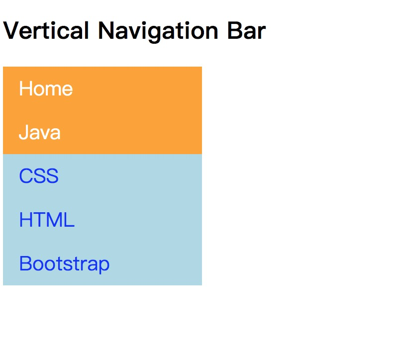
垂直导航栏
在此示例中,我们将了解如何构建垂直导航栏。
示例
<!DOCTYPE html>
<html>
<head>
<style>
ul {
list-style-type: none;
margin: 0;
padding: 0;
width: 200px;
background-color: lightblue;
}
li a {
display: block;
color: blue;
font-size:20px;
padding: 8px 16px;
text-decoration: none;
}
.active{
background-color: orange;
color: white;
}
li a:hover {
background-color: orange;
color: white;
}
</style>
</head>
<body>
<h2>Vertical Navigation Bar</h2>
<ul>
<li><a href="#" class = "active">Home</a></li>
<li><a href = "#">Java</a></li>
<li><a href = "#">CSS</a></li>
<li><a href = "#">HTML</a></li>
<li><a href = "#">Bootstrap</a></li>
</ul>
</body>
</html>
输出:
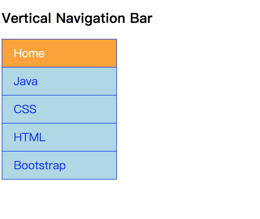
我们可以将链接对准中心并在它们之间添加边框。
示例
<!DOCTYPE html>
<html>
<head>
<style>
ul {
list-style-type: none;
margin: 0;
padding: 0;
width: 200px;
background-color: lightblue;
border: 1px solid blue;
}
li a {
display: block;
color: blue;
font-size:20px;
padding: 10px 20px;
text-decoration: none;
border-bottom: 1px solid blue;
}
ul:last-child {
border-bottom: none;
}
.active{
background-color: orange;
color: white;
}
li a:hover {
background-color: orange;
color: white;
}
</style>
</head>
<body>
<h2>Vertical Navigation Bar</h2>
<ul>
<li><a href="#" class = "active">Home</a></li>
<li><a href = "#">Java</a></li>
<li><a href = "#">CSS</a></li>
<li><a href = "#">HTML</a></li>
<li><a href = "#">Bootstrap</a></li>
</ul>
</body>
</html>
输出:
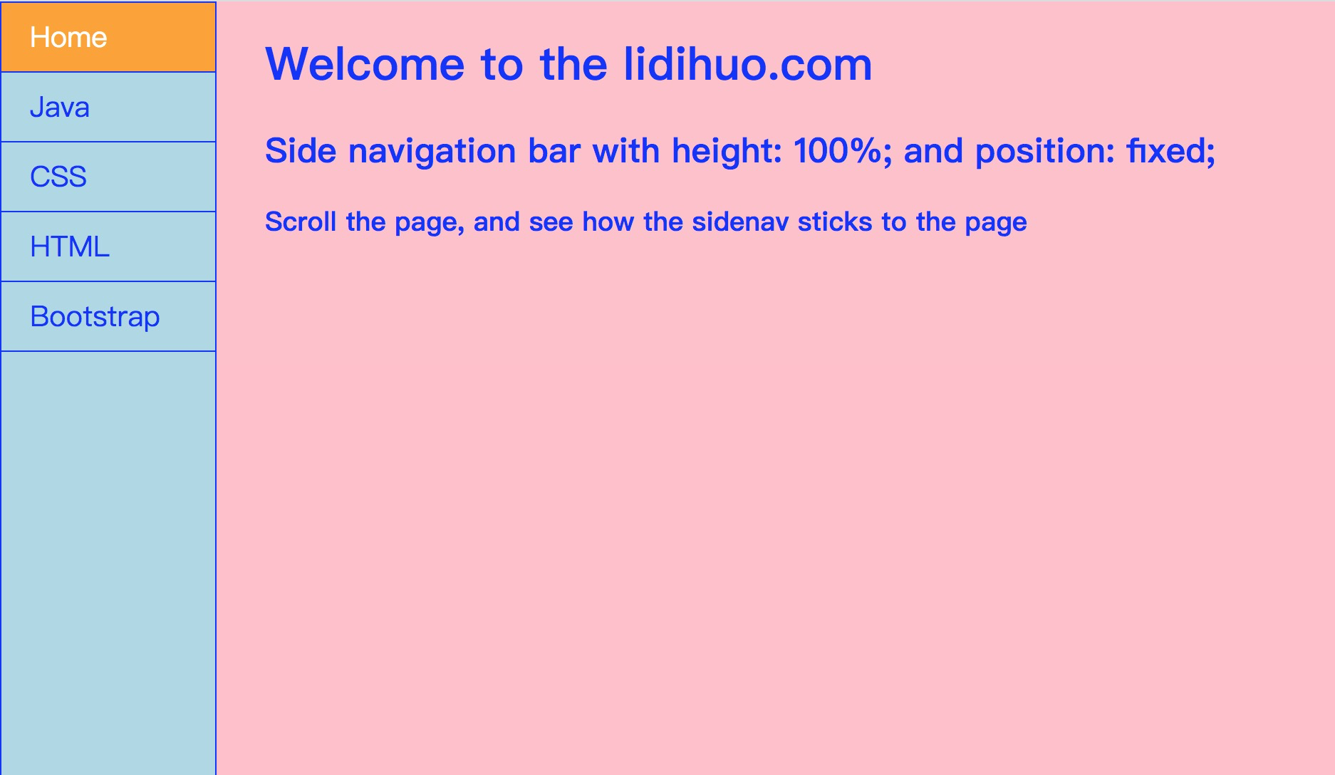
全高固定垂直导航栏
我们还可以使用属性
height:100%; 创建固定全高侧面导航栏和
位置:固定;
示例
<!DOCTYPE html>
<html>
<head>
<style>
body{
background-color: pink;
}
ul {
list-style-type: none;
margin: 0;
padding: 0;
height:100%;
top:0;
width:150px;
overflow: auto;
background-color: lightblue;
border: 1px solid blue;
position: fixed;
}
li a {
display: block;
color: blue;
font-size:20px;
padding: 10px 20px;
text-decoration: none;
border-bottom: 1px solid blue;
}
.active{
background-color: orange;
color: white;
}
li a:hover {
background-color: orange;
color: white;
}
</style>
</head>
<body>
<ul>
<li><a href = "#" class = "active">Home</a></li>
<li><a href = "#">Java</a></li>
<li><a href = "#">CSS</a></li>
<li><a href = "#">HTML</a></li>
<li><a href = "#">Bootstrap</a></li>
</ul>
<div style="margin-left:20%;padding-bottom:2000px;color:blue;">
<h1>Welcome to the lidihuo.com</h1>
<h2>Side navigation bar with height: 100%; and position: fixed;</h2>
<h3>Scroll the page, and see how the sidenav sticks to the page</h3>
</div>
</body>
</html>
输出:

