CSS radial-gradient()
radius-gradient()是内置的CSS函数,可在两种或两种以上颜色之间产生平滑过渡。它将径向渐变设置为背景图像。它可以是圆形或椭圆形。
它可以节省带宽使用量,并有助于减少下载时间。在径向渐变中,颜色从单个点出现,然后向外扩散。径向渐变由其中心点和结束形状以及两个或两个以上的色标定义。
语法
background-image: radial-gradient(shape size at position, start-color, ..., last-color);
让我们讨论其论点。
position:它定义渐变位置。其默认值为center。可以以单位(例如px,em等)或关键字(例如底部,左侧等)指定。
shape:它定义了渐变,可以是圆形或椭圆形。如果未指定其值,则将其设置为其默认值,即椭圆。
size:它定义渐变尺寸。其可能的值为:
farthest-corner
farthest-side
closest-corner
closest-side
它的默认值是 farthest-corner。
开始颜色 ...... 最后颜色:它保存颜色值,后跟一个可选值
让我们尝试通过一些插图来理解
radial-gradient()函数。
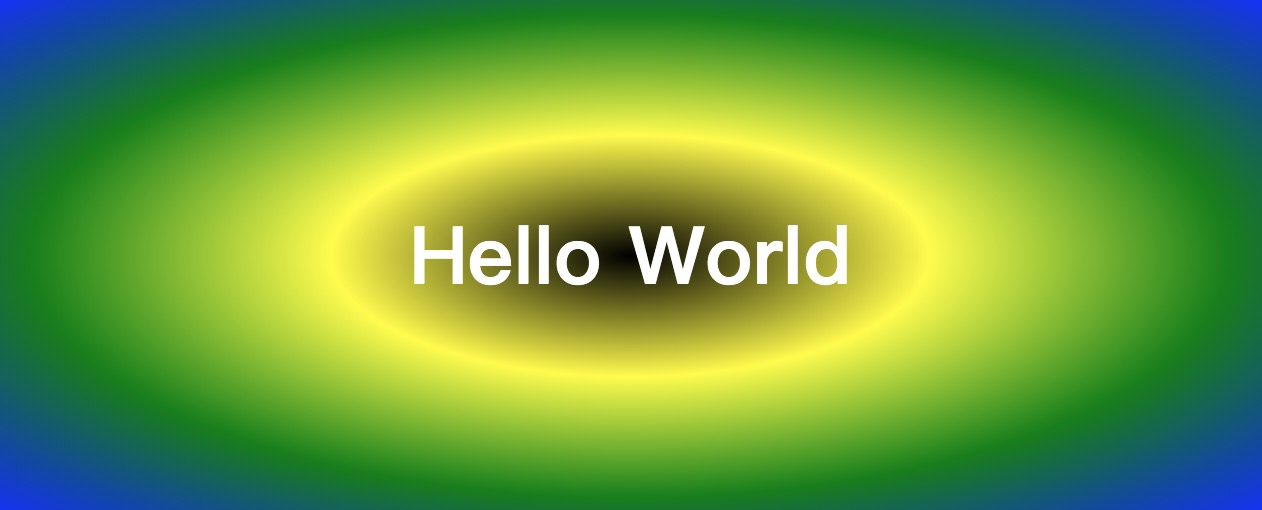
示例1
<!DOCTYPE html>
<html>
<head>
<title>CSS Gradients</title>
<style>
#main {
background-image: radial-gradient(black, yellow, green, blue);
}
.hello {
text-align: center;
font-size: 40px;
color: white;
font-weight: bold;
padding: 100px;
}
</style>
</head>
<body>
<div id="main">
<div class="hello">Hello World</div>
</div>
</body>
</html>
输出
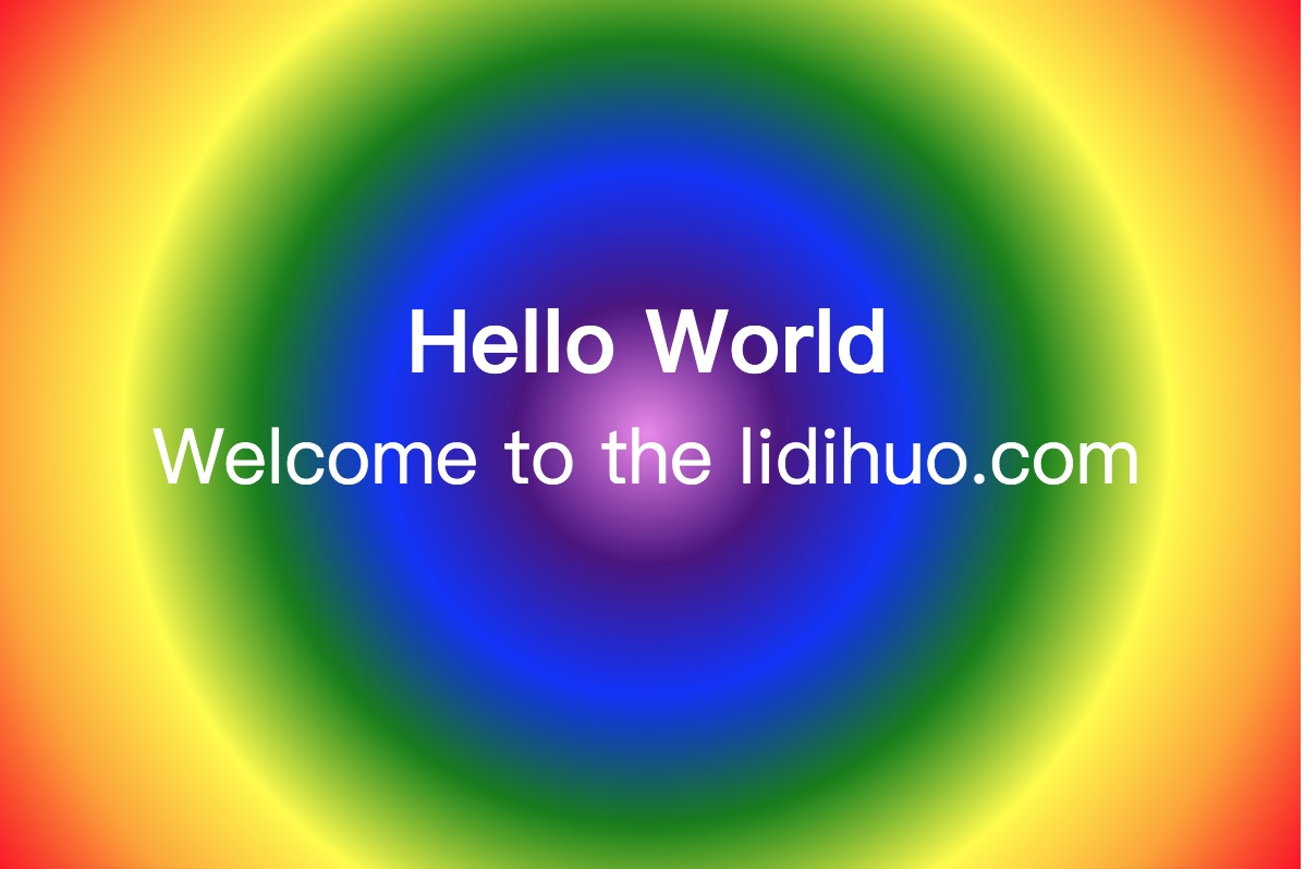
示例2
在此示例中,我们将设置径向渐变的形状。
<!DOCTYPE html>
<html>
<head>
<title>CSS Gradients</title>
<style>
#main {
height: 400px;
width: 600px;
background-image: radial-gradient(circle, violet, indigo, blue, green, yellow, orange, red);
}
.hello {
text-align: center;
font-size: 40px;
color: white;
font-weight: bold;
padding-top: 130px;
}
.div2 {
font-size: 35px;
color: white;
text-align: center;
}
</style>
</head>
<body>
<div id="main">
<div class="hello">Hello World</div>
<div class="div2">Welcome to the lidihuo.com</div>
</div>
</body>
</html>
输出
示例3
在此示例中,我们将设置径向梯度的大小。
<!DOCTYPE html>
<html>
<head>
<title>CSS Gradients</title>
<style>
.demo div {
float: left;
}
.demo1 div {
float: left;
}
#main1 {
height: 400px;
width: 600px;
background-image: radial-gradient(farthest-side at left bottom, red, yellow, cyan);
margin: 20px;
}
#main2 {
height: 400px;
width: 600px;
background-image: radial-gradient(farthest-corner at right bottom, blue, yellow, green);
margin: 20px;
}
#main3 {
height: 400px;
width: 600px;
background-image: radial-gradient(closest-side, red, yellow, lightgreen);
margin: 20px;
}
#main4 {
height: 400px;
width: 600px;
background-image: radial-gradient(closest-corner, blue, yellow, green);
margin: 20px;
}
.size {
text-align: center;
font-size: 40px;
color: black;
font-weight: bold;
padding-top: 130px;
}
</style>
</head>
<body>
<div class="demo">
<div id="main1">
<div class="size">farthest-side at left bottom</div>
</div>
<div id="main2">
<div class="size">farthest-corner at right bottom</div>
</div>
</div>
<div class="demo1">
<div id="main3">
<div class="size">closest-side</div>
</div>
<div id="main4">
<div class="size">closest-corner</div>
</div>
</div>
</body>
</html>
输出


